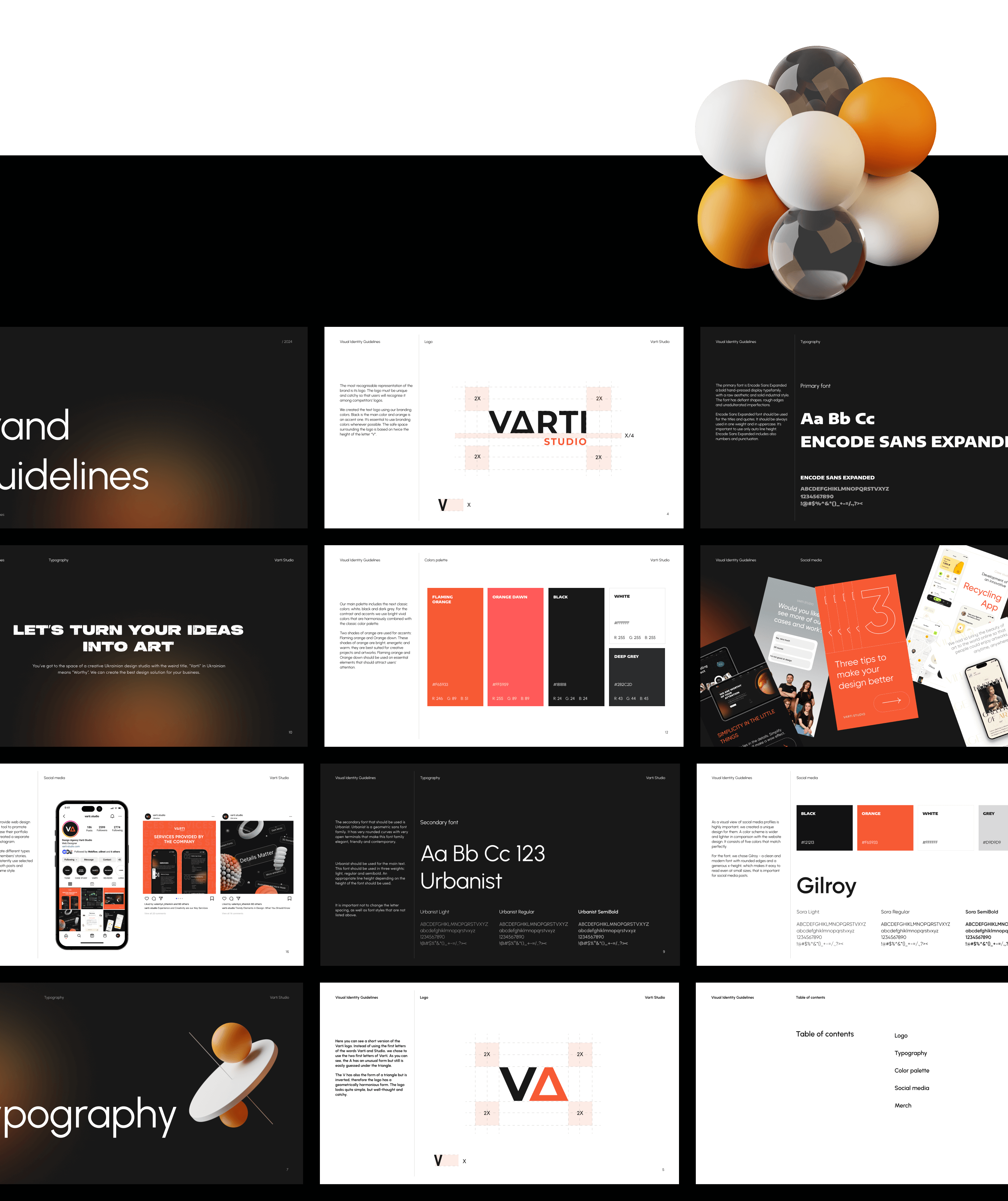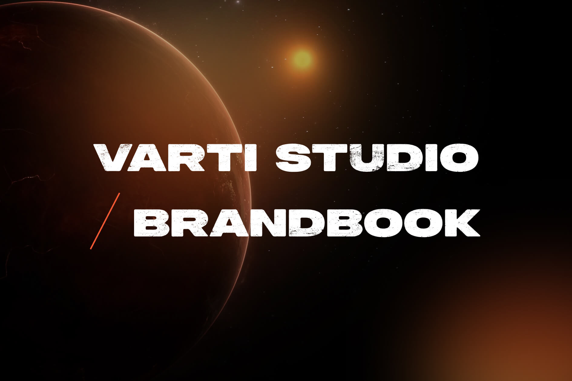
About Project
Over time, as new trends emerged and our professional skills developed, we decided to redesign our website varti-studio.com. To make our design work simpler and consistent, we’ve created a brand book. This comprehensive guide serves as a strategic tool that reflects our design principles and provides a standardized framework for our redesign work.
Fonts and Colors
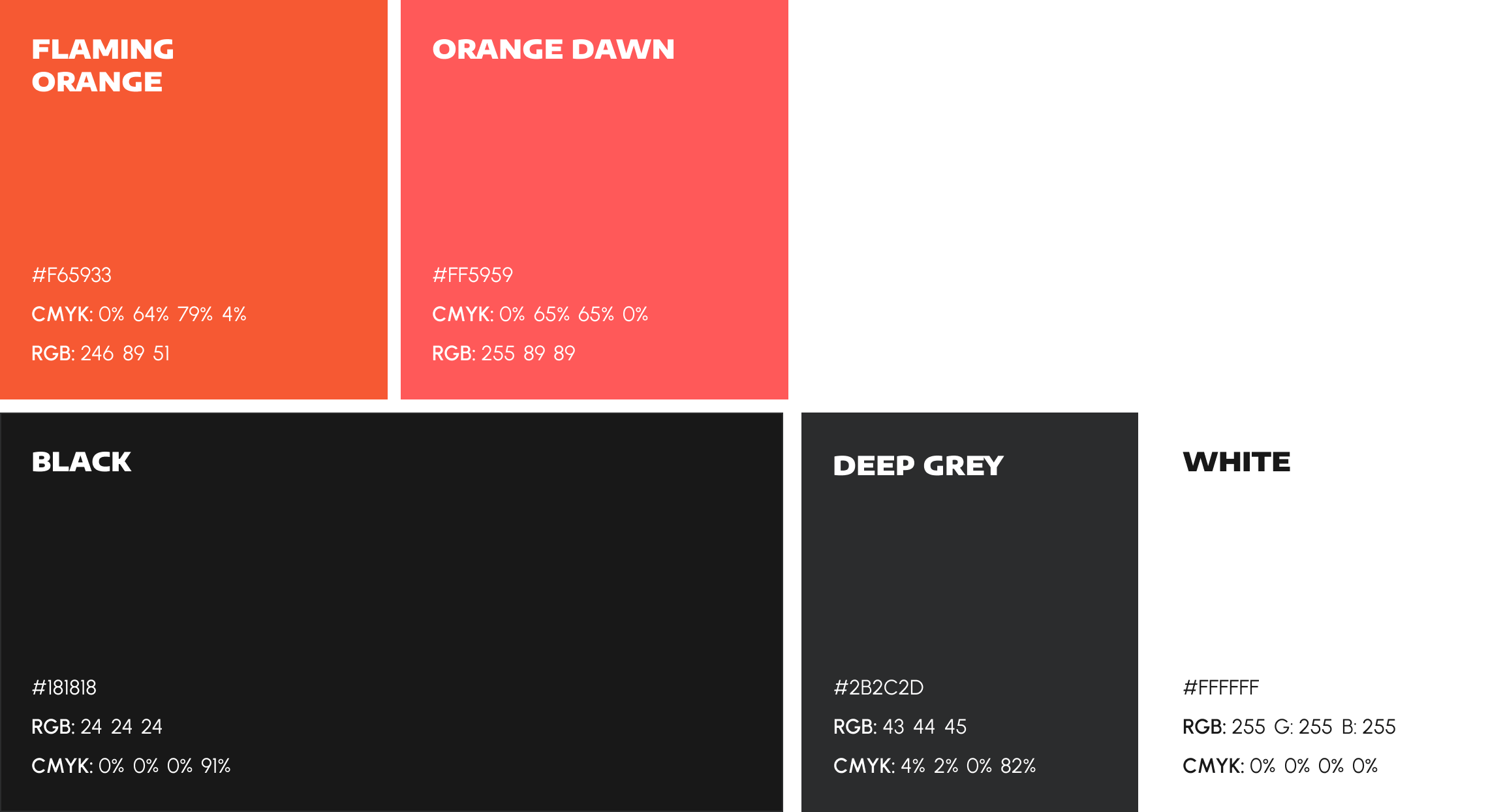
Colors
Our main palette includes the next classic colors: white, black and dark grey. For the contrast and accents we use bright vivid colors that are harmoniously combined with the classic color palette.
Two shades of orange are used for accents: Flaming orange and Orange down. These shades of orange are bright, energetic and warm, they are best suited for creative projects and artworks. Flaming orange and Orange down should be used on essential elements that should attract users’ attention.
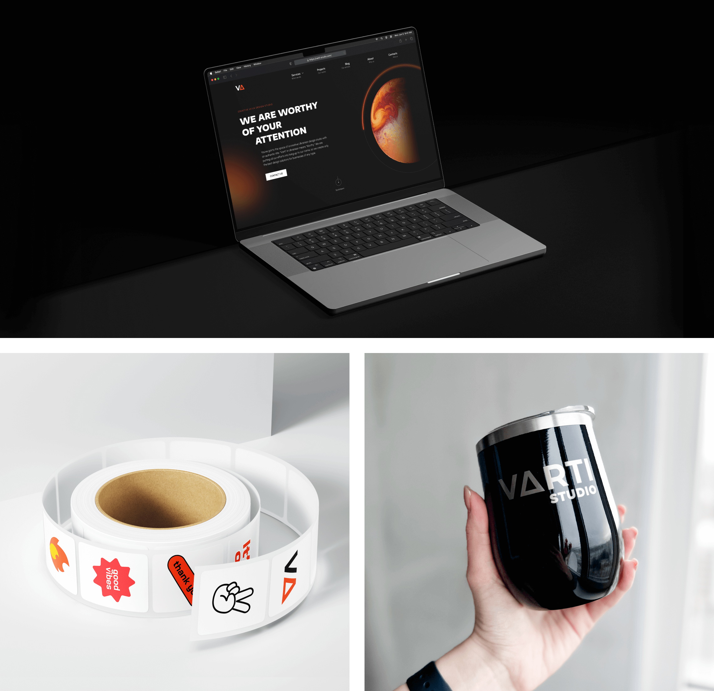
Merch is an important aspect of modern marketing and branding. That’s why we have our own merch. Now two items are available: hoodies and T-shirts in black color. To make items unique, each member of the team chose his/her prominent phrase.
A unifying elements is our text logo in colors of the Ukrainian flag on the upper left of an item and a unique under the logo. The phrase should be white.
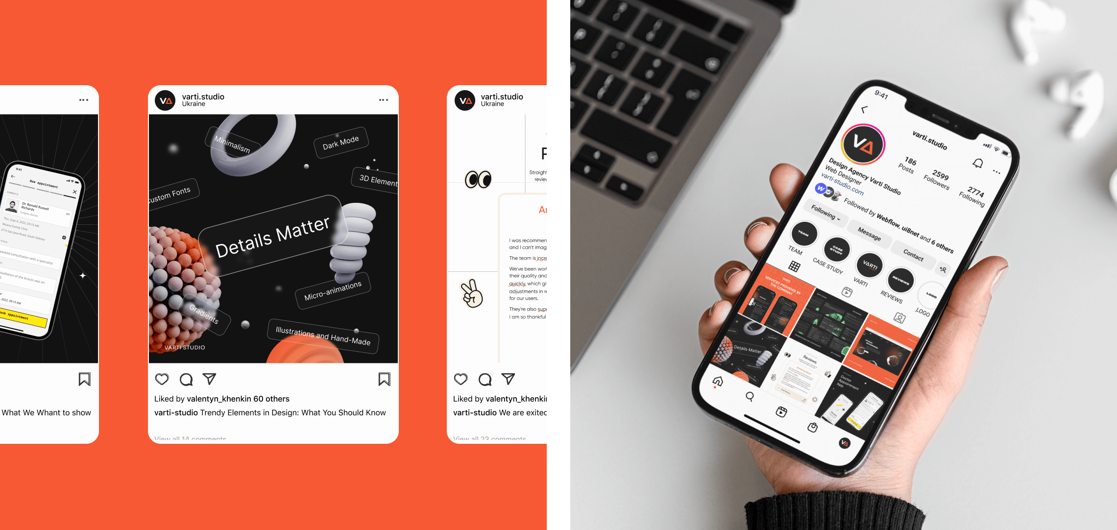
Social media platforms provide web design agencies with a powerful tool to promote their services and showcase their portfolio of work. That’s why we created a separate style guide for posts on Instagram.
It is very important to rotate different types of posts (reviews, team members’ stories, showcases etc) and consistently use selected colors. Both posts and stories should be in the same style.