About Project
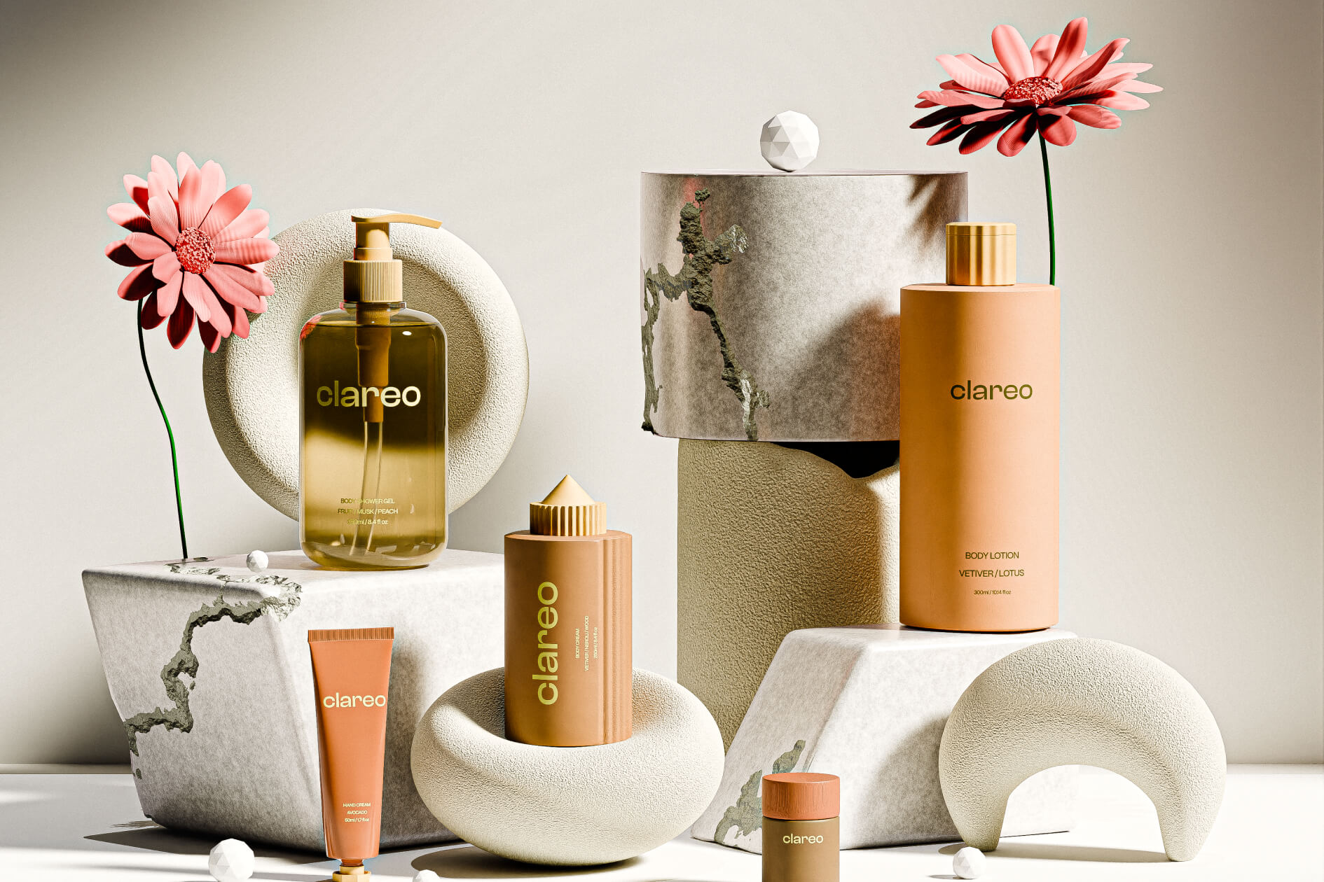
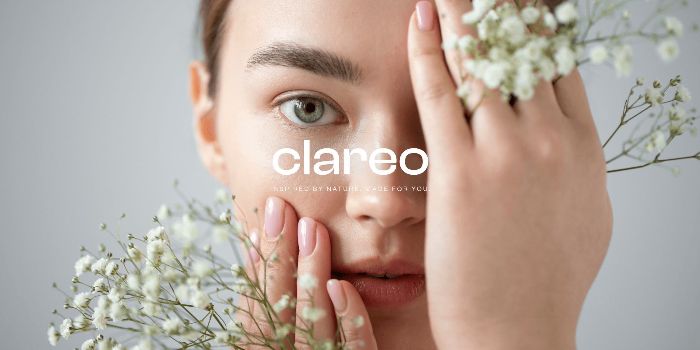
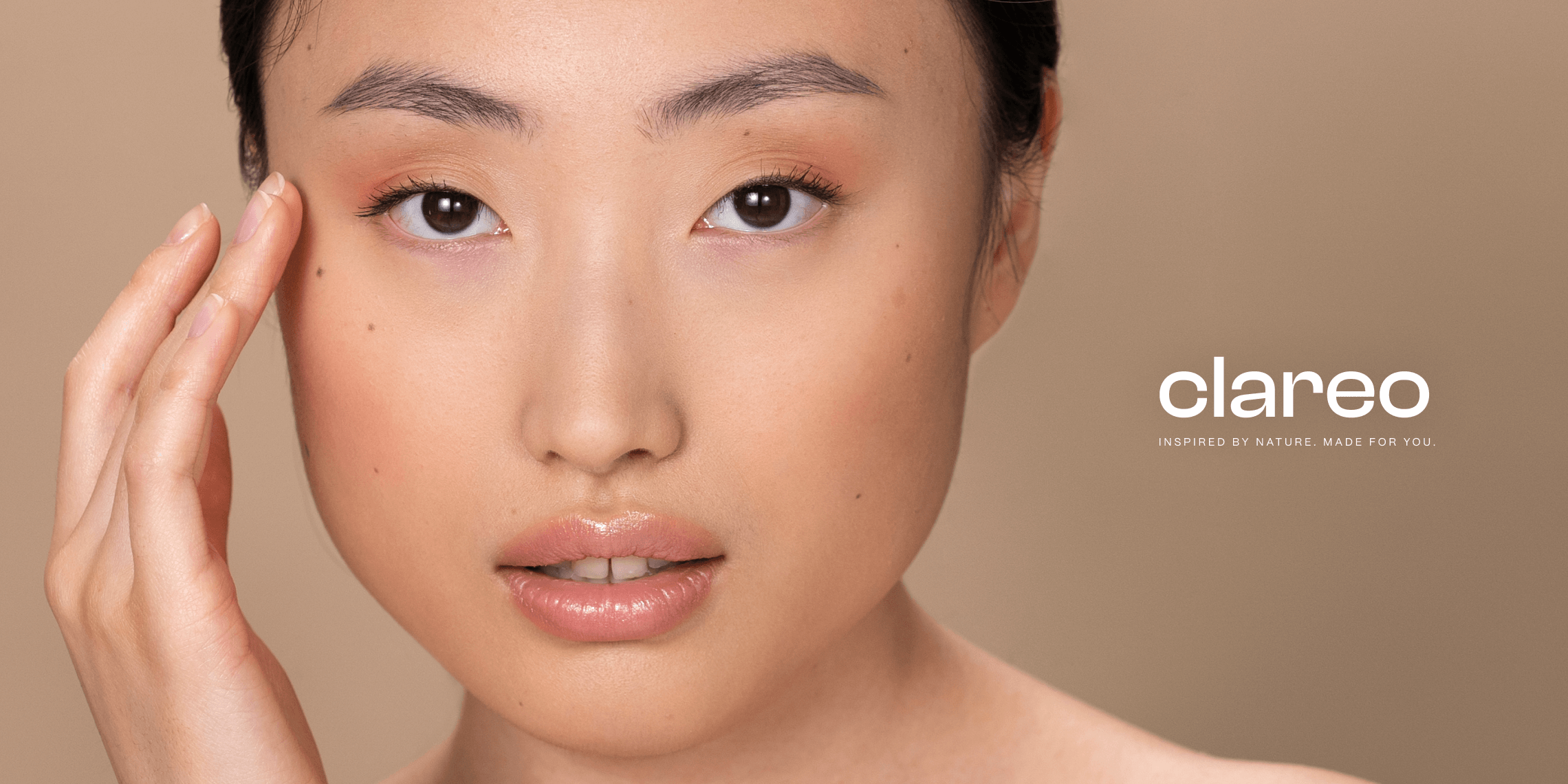
Clareo develops skincare products crafted from natural ingredients, prioritizing sustainability and a deep respect for the environment. Each product reflects a commitment to ecological balance, offering effective care while minimizing the impact on nature.
Our goal
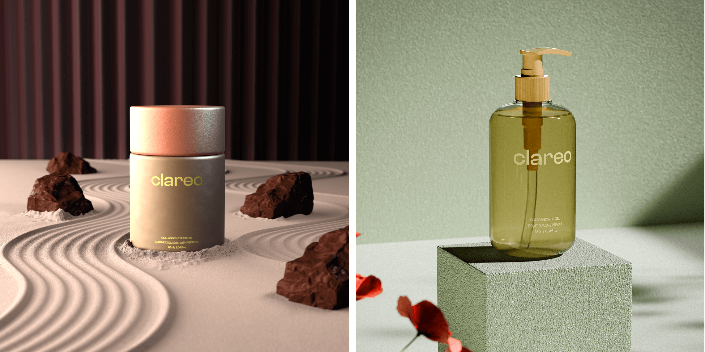
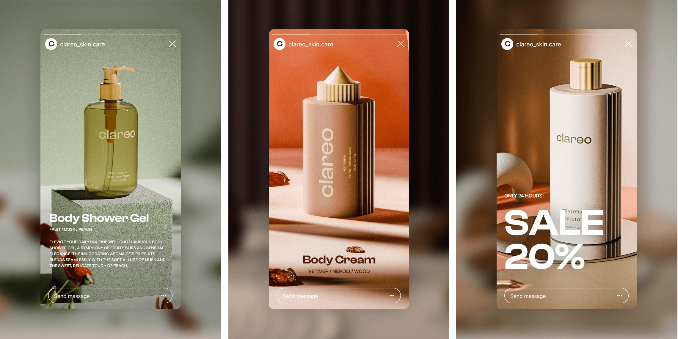
Our task was to create realistic 3D product models that highlight the brand’s natural and eco-friendly essence while emphasizing the aesthetic appeal of the packaging.
Particular attention was given to developing a visualization that accurately reflects the brand’s values and captures the target audience’s interest.
Visual Design
Natural textures, muted pastel shades, and minimalist forms were chosen for the visual design to create a harmonious and organic look. The main goal was to reflect the brand’s strong connection to nature and its commitment to sustainability.
A soft color palette and a clean design emphasized simplicity, purity, and sophistication, effectively conveying the brand’s values and drawing attention to its unique style.
Materials and Textures
The design features elements that mimic natural materials such as stone, sand, and wood, adding a sense of organic quality and durability. These textures emphasize the brand’s sustainability and eco-friendliness, creating a harmonious blend with the overall visual concept.
Shapes and Composition
The minimalist packaging shapes emphasize simplicity and modernity. The compositions incorporate natural elements such as flowers and stones to create a harmonious and aesthetically pleasing visual language. Each element of the visualization was carefully designed to establish a unified style that reflects the brand’s philosophy.
Color Palette & typography
Color Palette
For this project, we used muted pastel shades that not only highlight the connection to nature but also create a sense of calm and lightness. Sand and terracotta tones symbolize the warmth of the earth, while green accents evoke naturalness and freshness. This approach helped create a visual balance between organic elements and modernity, perfectly aligning with the brand’s philosophy.
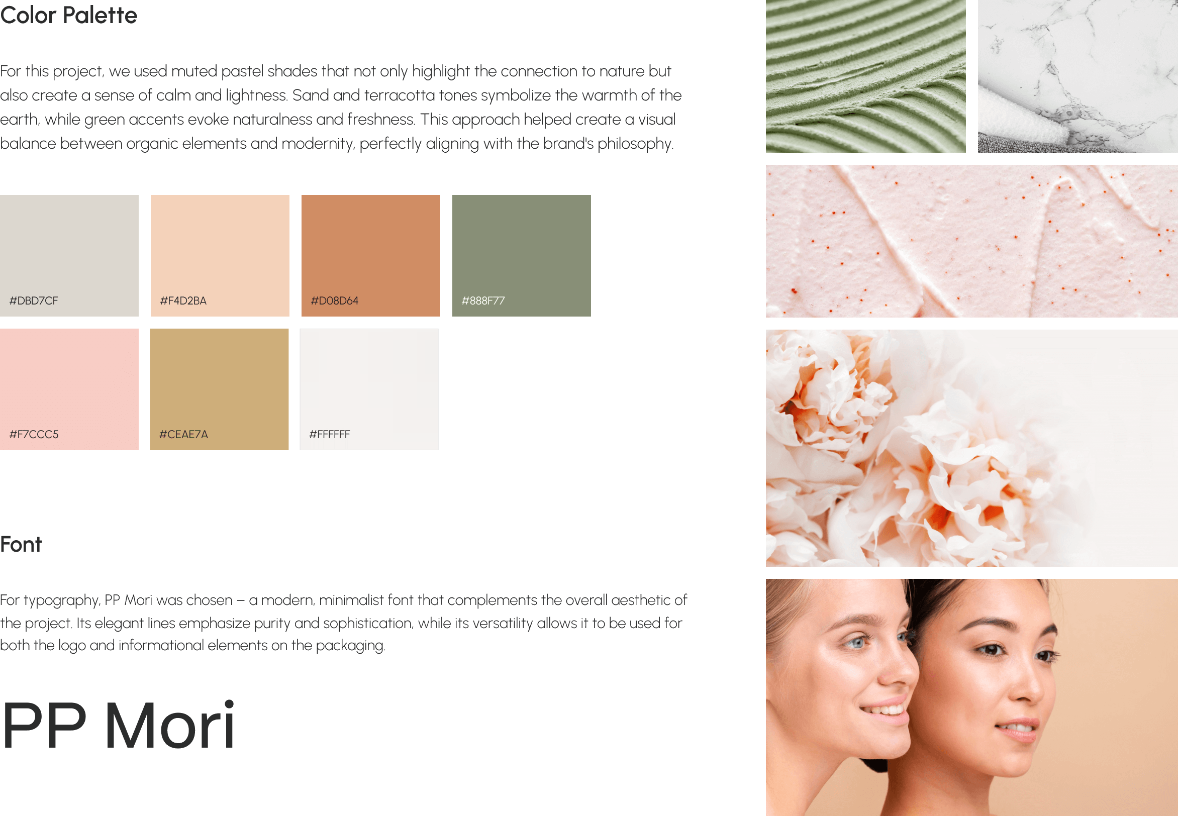
Font
For typography, PP Mori was chosen – a modern, minimalist font that complements the overall aesthetic of the project. Its elegant lines emphasize purity and sophistication, while its versatility allows it to be used for both the logo and informational elements

Conclusion
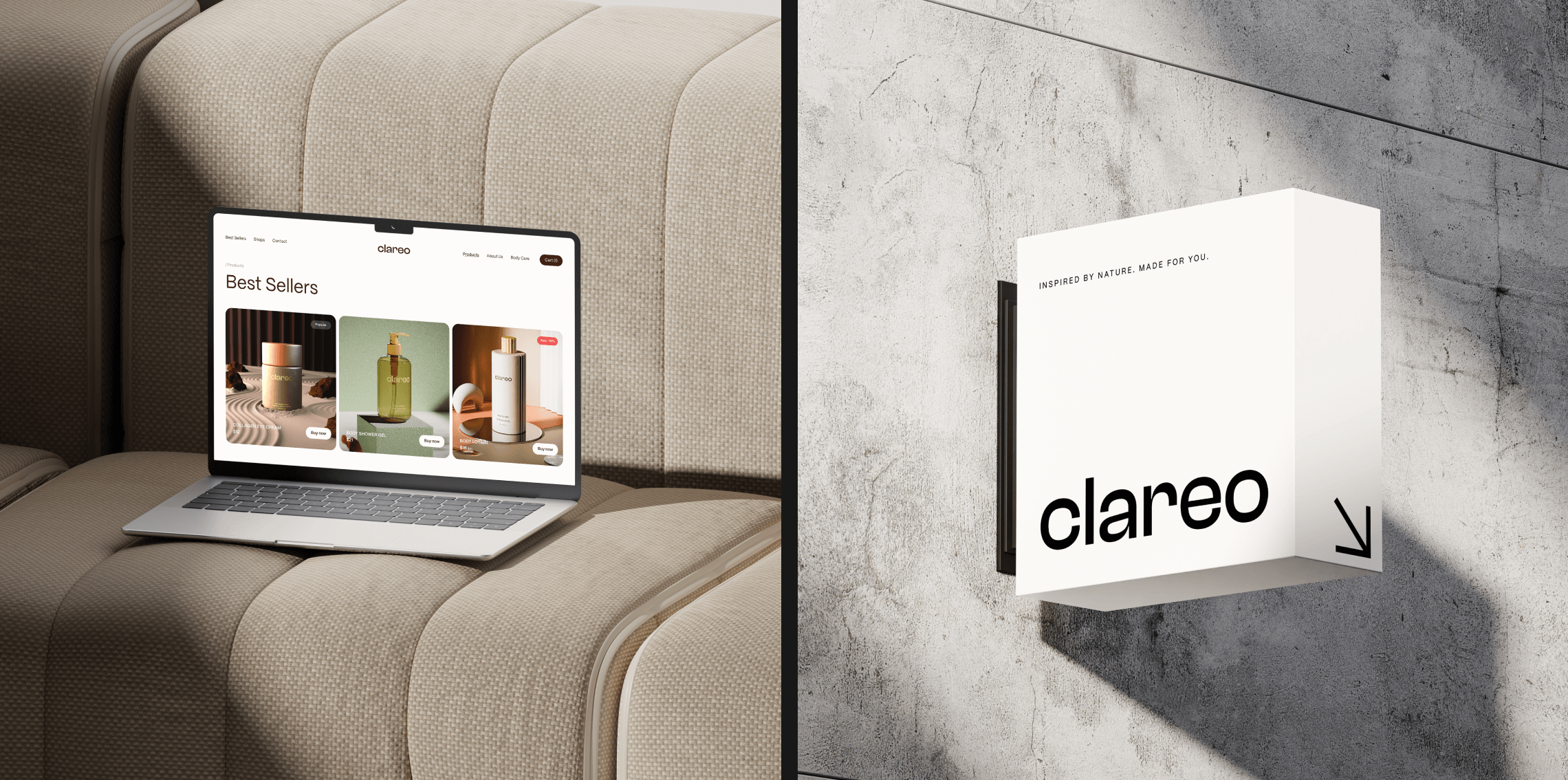
Our project successfully translated the brand’s philosophy into a visual form by creating harmonious and aesthetically refined 3D models of the skincare products.
These visualizations showcase the brand’s versatility, demonstrating its ability to adapt naturally to various formats, whether it be a website, social media, or outdoor advertising.