About Project
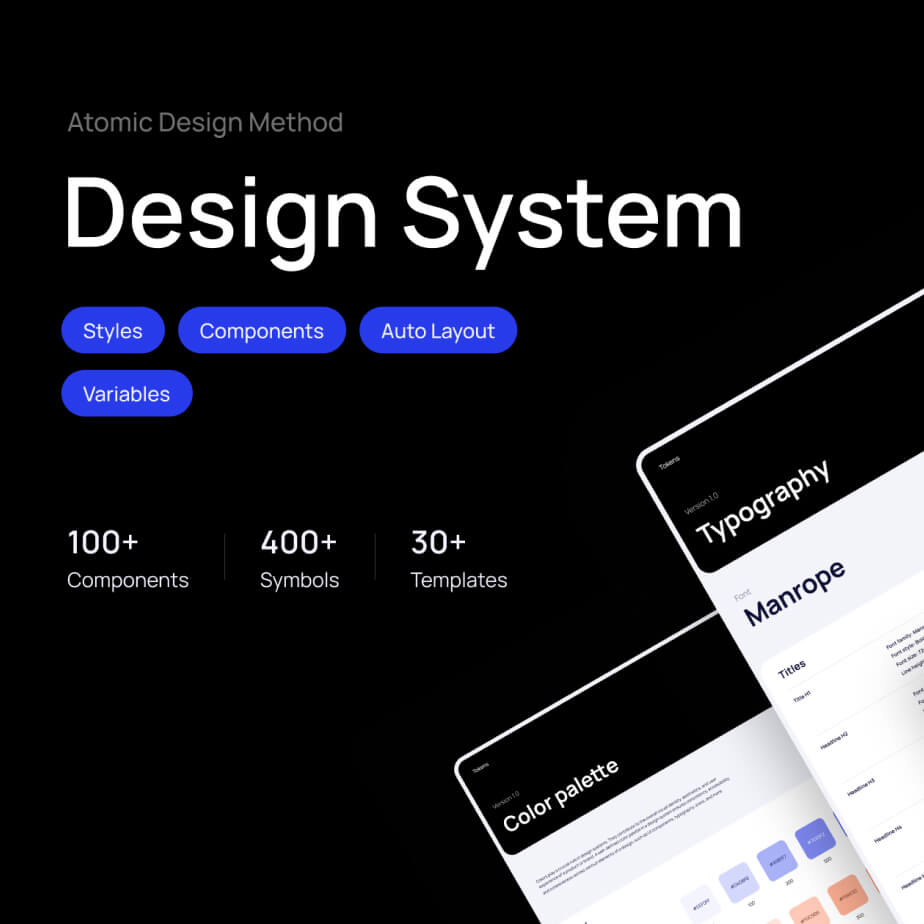
What is an Atomic Design?
Atomic design is a product design methodology that’s based on a hierarchy of varyingly complex components. Its creator Brad Frost classified it into six stages: tokens, atoms, molecules, organisms, templates, and pages. According to this theory, a change at any stage will affect all stages that come after it.

Tokens
The smallest functional units of matter at the sub-atomic level, consistent with raw values. Represented by context-agnostic names or names with a shared semantic meaning to a majority group of items within a component.

Atoms
These are the smallest units that cannot be broken down into parts without losing their meaning.

Molecules
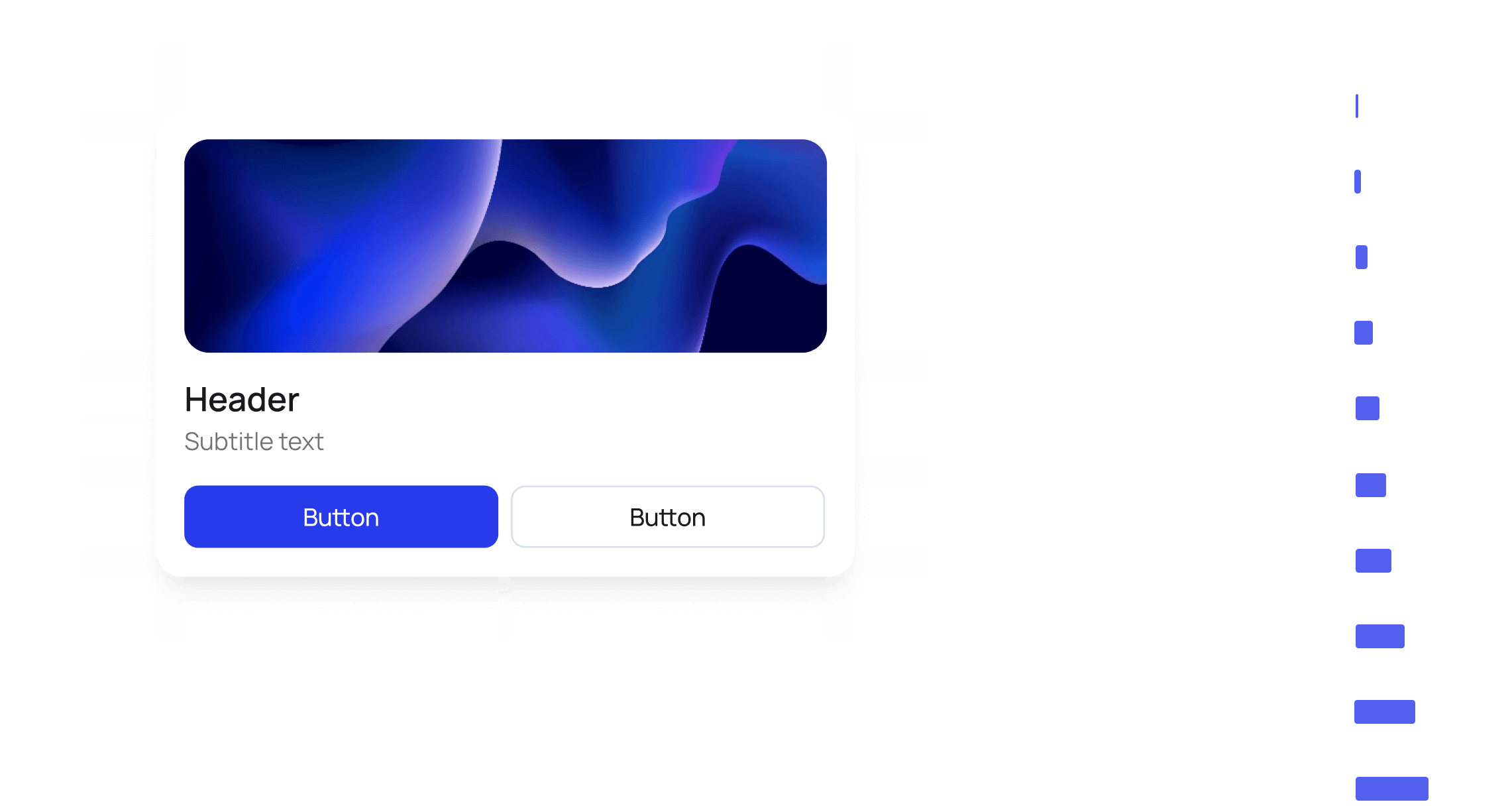
Molecules are combinations of atoms that work together to form more complex UI elements, such as form fields, buttons with icons, navigation bars, or dropdown menus.

Organisms
Organisms refer to complex UI components made up of groups of molecules and/or atoms and possibly other organisms. These are relatively complex sections of a user interface that form distinct parts of a system.

Templates
Templates in atomic design are the equivalent of wireframes containing grayscale placeholders before real content is available, serving as foundational structures for page
layouts and content organization.

Pages
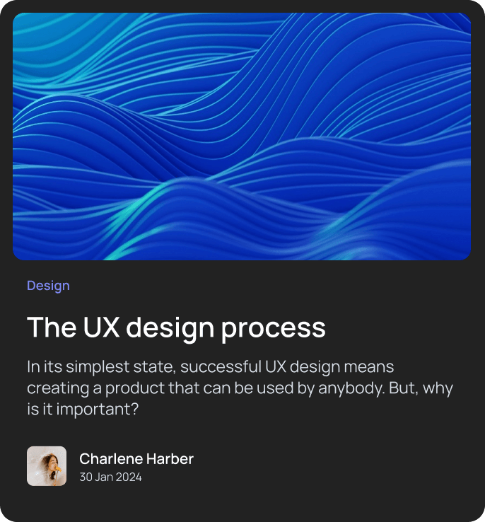
In the atomic design, pages are instances of templates populated with real content, presenting the final output for user interaction and experience.
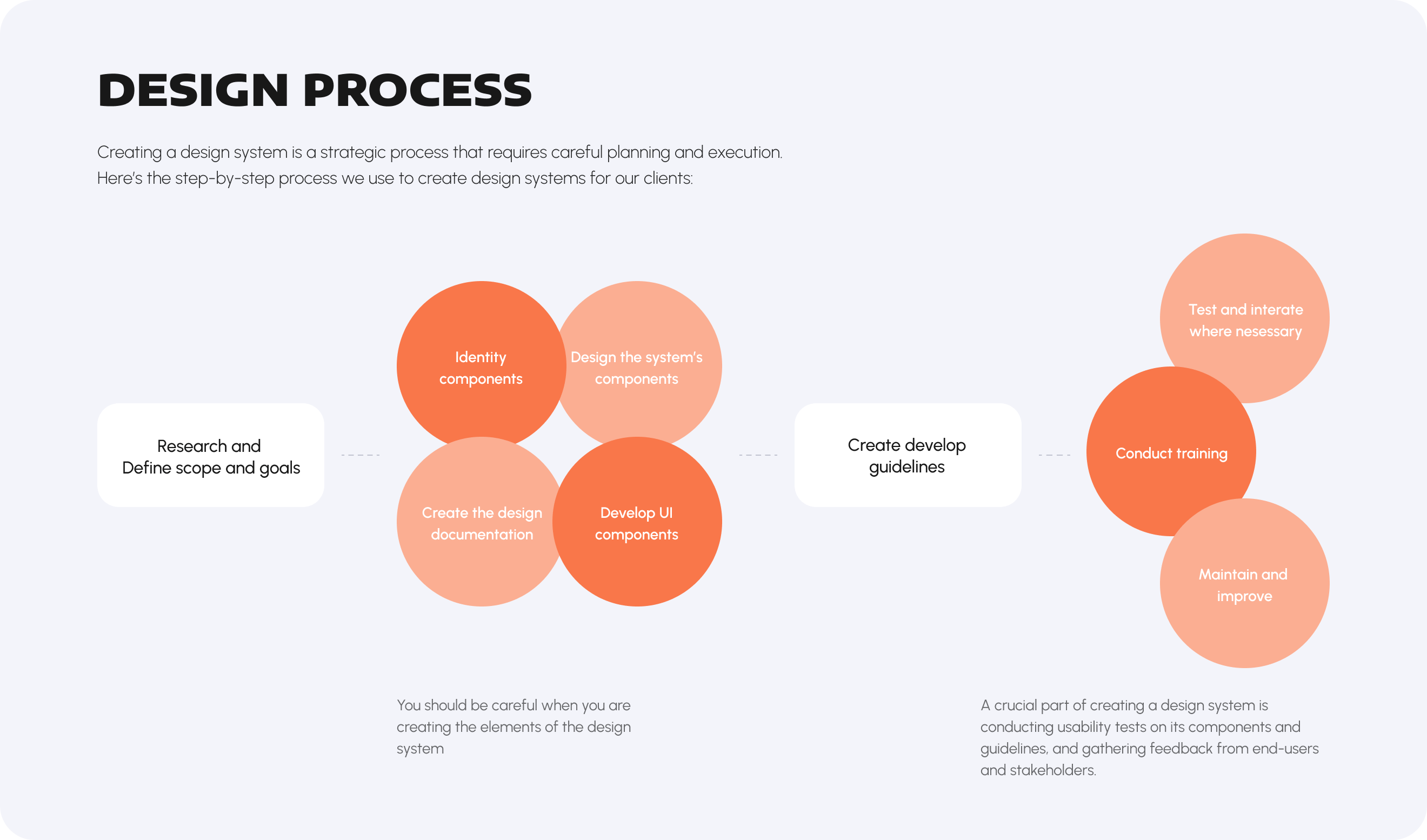
design process
Creating a design system is a strategic process that requires careful planning and execution. Here’s the step-by-step process we use to create design systems for our clients:
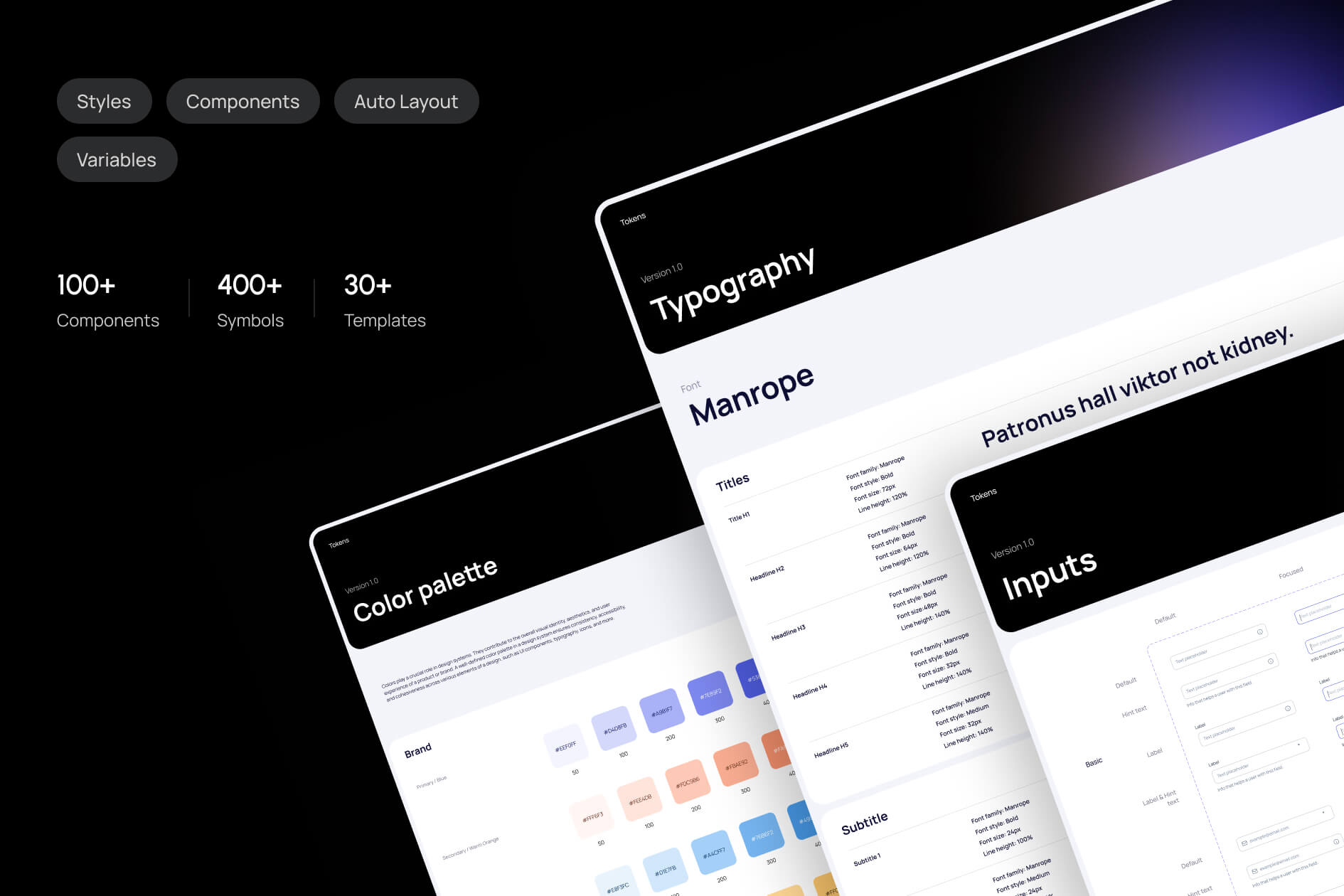
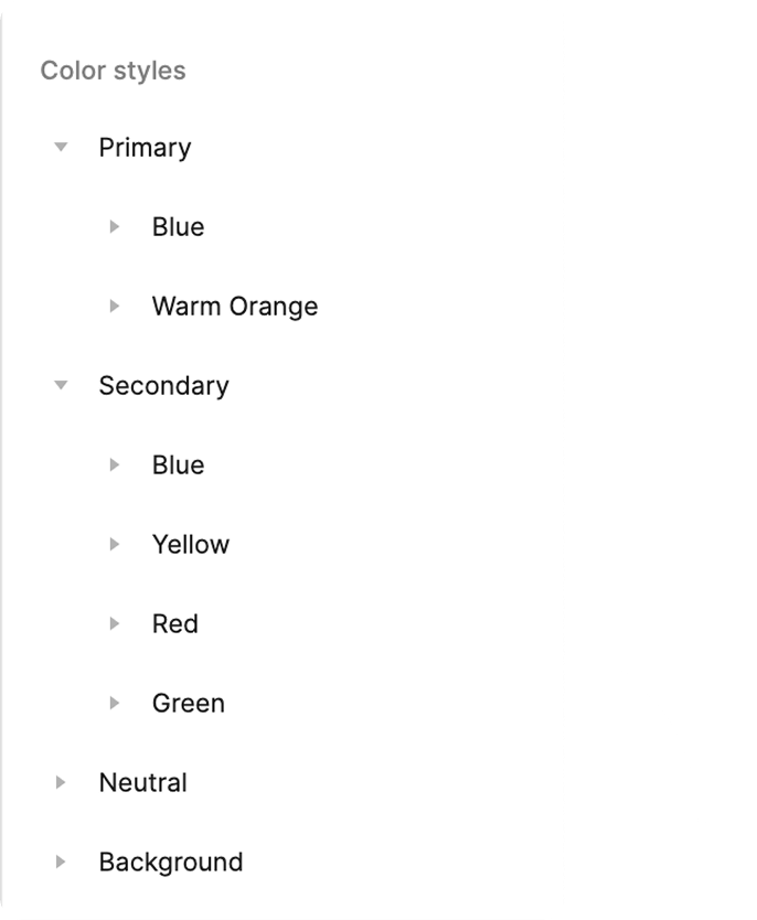
Fonts and Colors
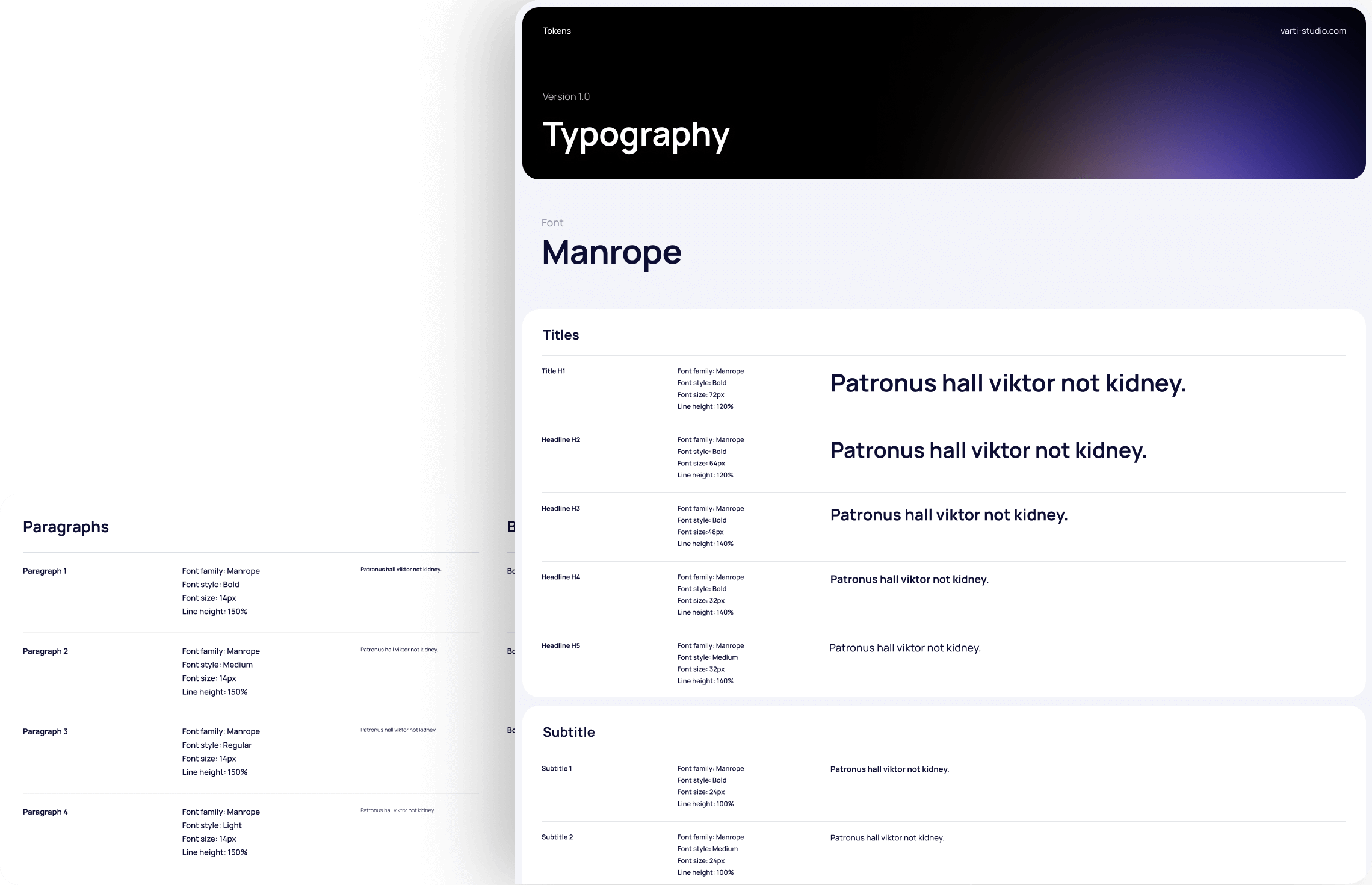
Typography
Before you dig into details, you have to settle on basics: font(or fonts). Through exploration, comparison, research, and often — for large companies — making a font themselves, every display cascades from and depends on this choice. Most design systems demonstrate a typography scale in documentation as a vertical stack.
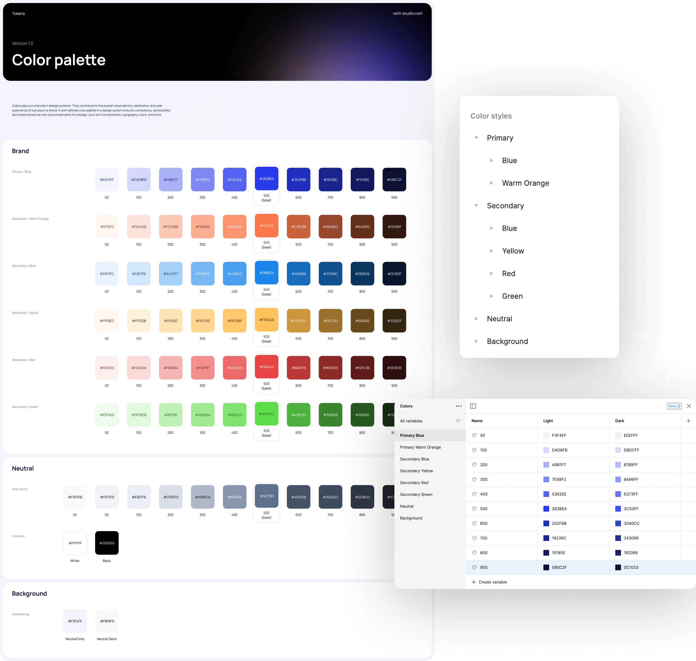
Colors
We start by understanding the brand’s identity, values, and objectives. Colors should align with the brand’s personality and message.

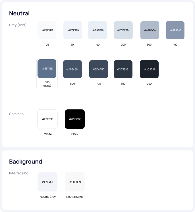
Tokens
Grid system
The grid is the structural foundation of all visual elements, from typography to columns, boxes, icons, and illustrations. It provides guidance for all creative decision-making, supporting content, and creating a consistent, repeatable, and responsive framework for design.
Spacing
The consistent and intentional use of a spacing system creates a more harmonious experience for the end user. A spacing system also lays a foundation for responsive design and customisable UI density in the future, which will enhance the overall quality and accessibility of our products.
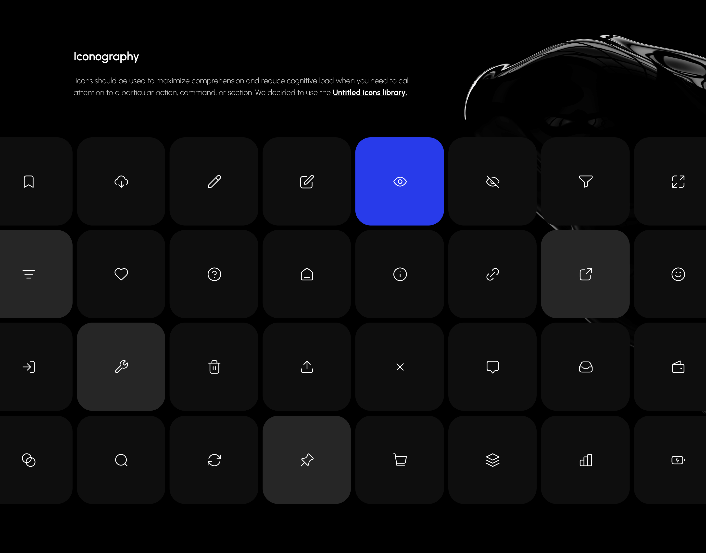
Iconography
Icons should be used to maximize comprehension and reduce cognitive load when you need to call attention to a particular action, command, or section. We decided to use the Untitled icons library.
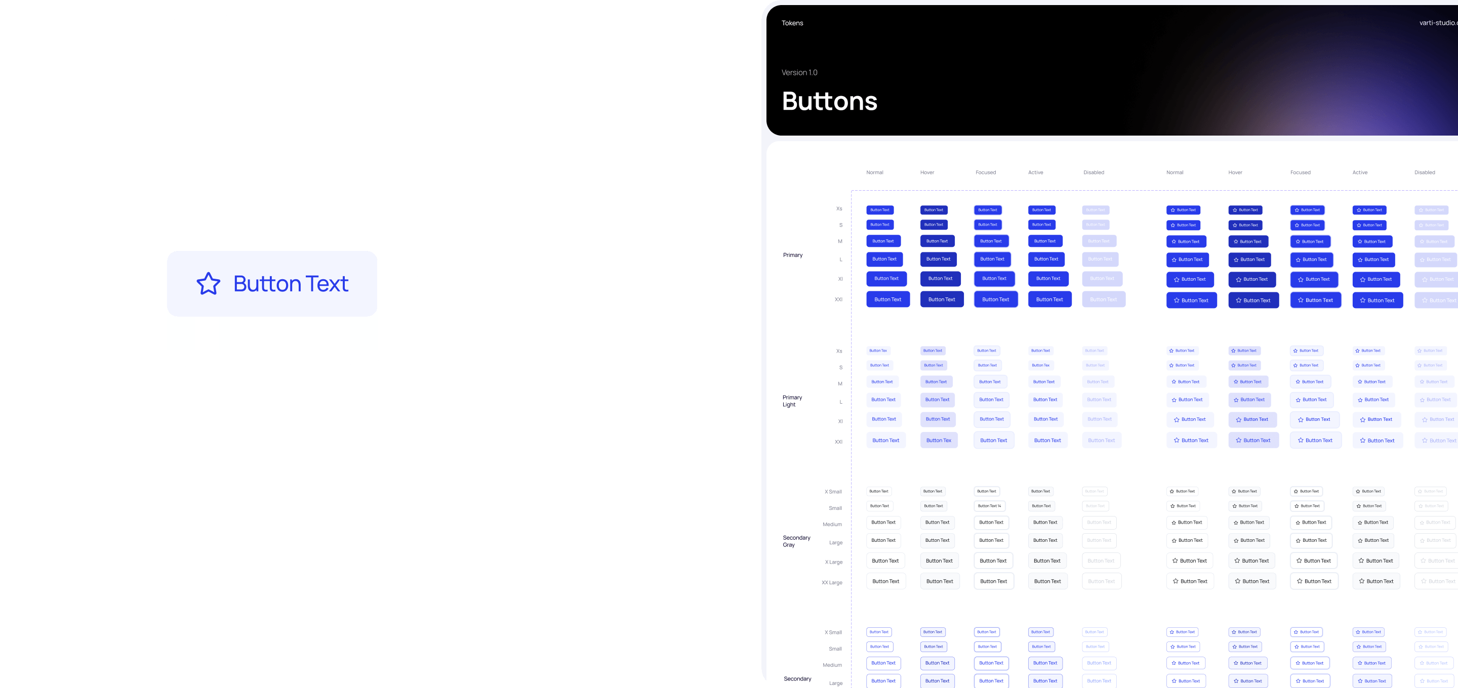
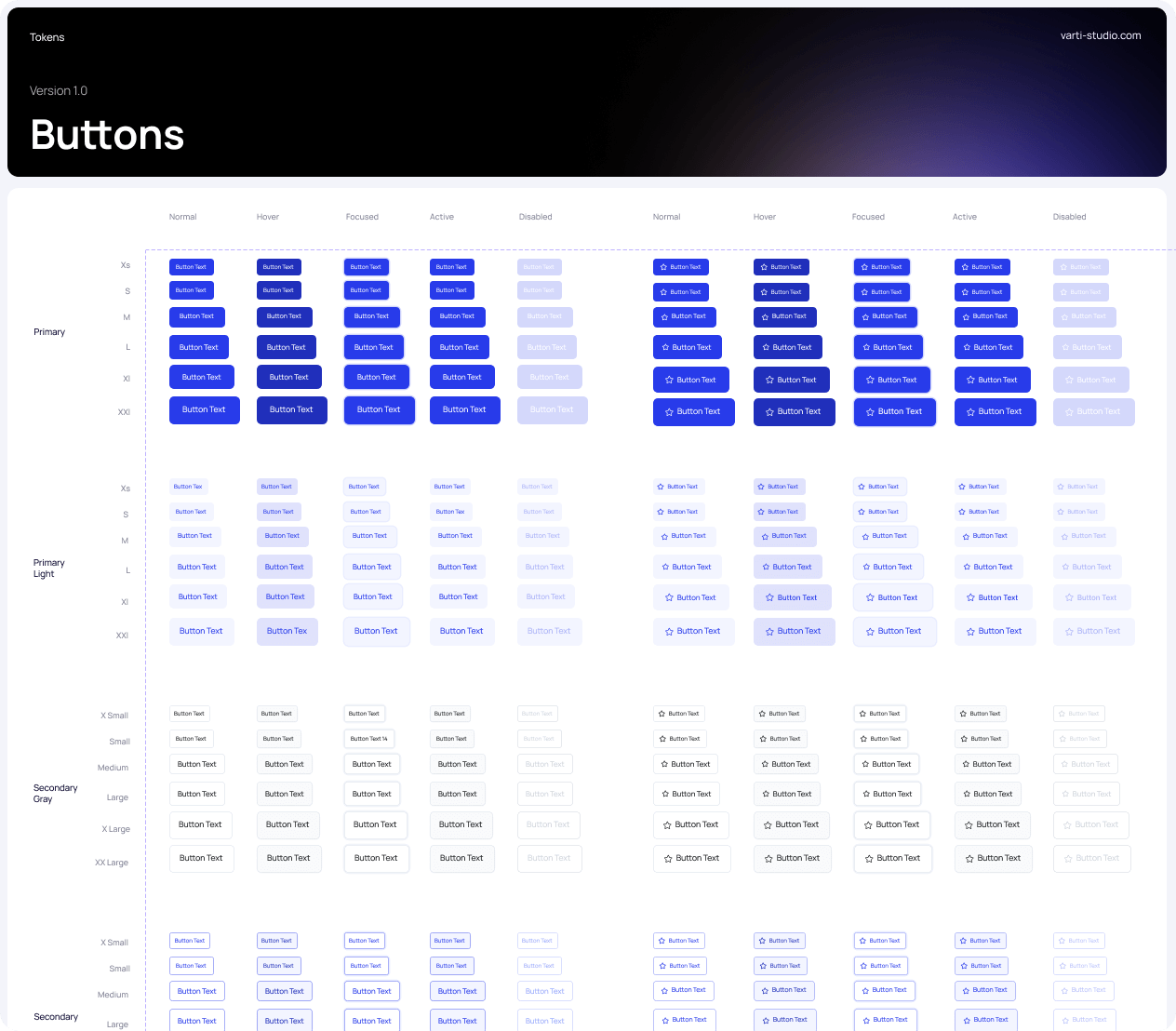
Buttons
Buttons are clickable elements that are used to trigger actions. They communicate calls to action to the user and allow users to interact with pages in a variety of ways. Button labels express what action will occur when the user interacts with it.
Atoms
Inputs and Dropdowns
Text input is an interactive field that allows users to enter text and data. It’s commonly used in form patterns.You can find the default text input, the text input with a button, and the password input. Password inputs include a hide/show control and can’t contain a button.
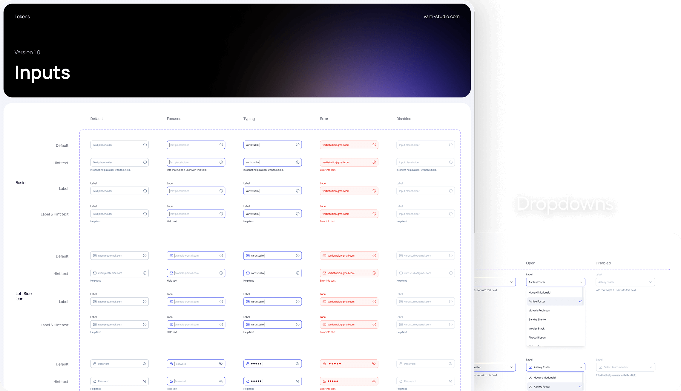
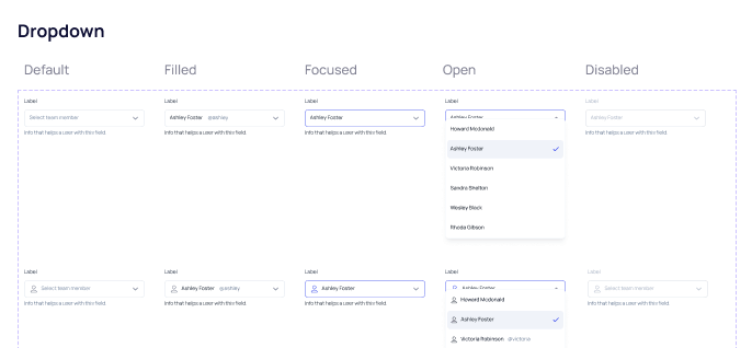
Dropdowns
Molecules
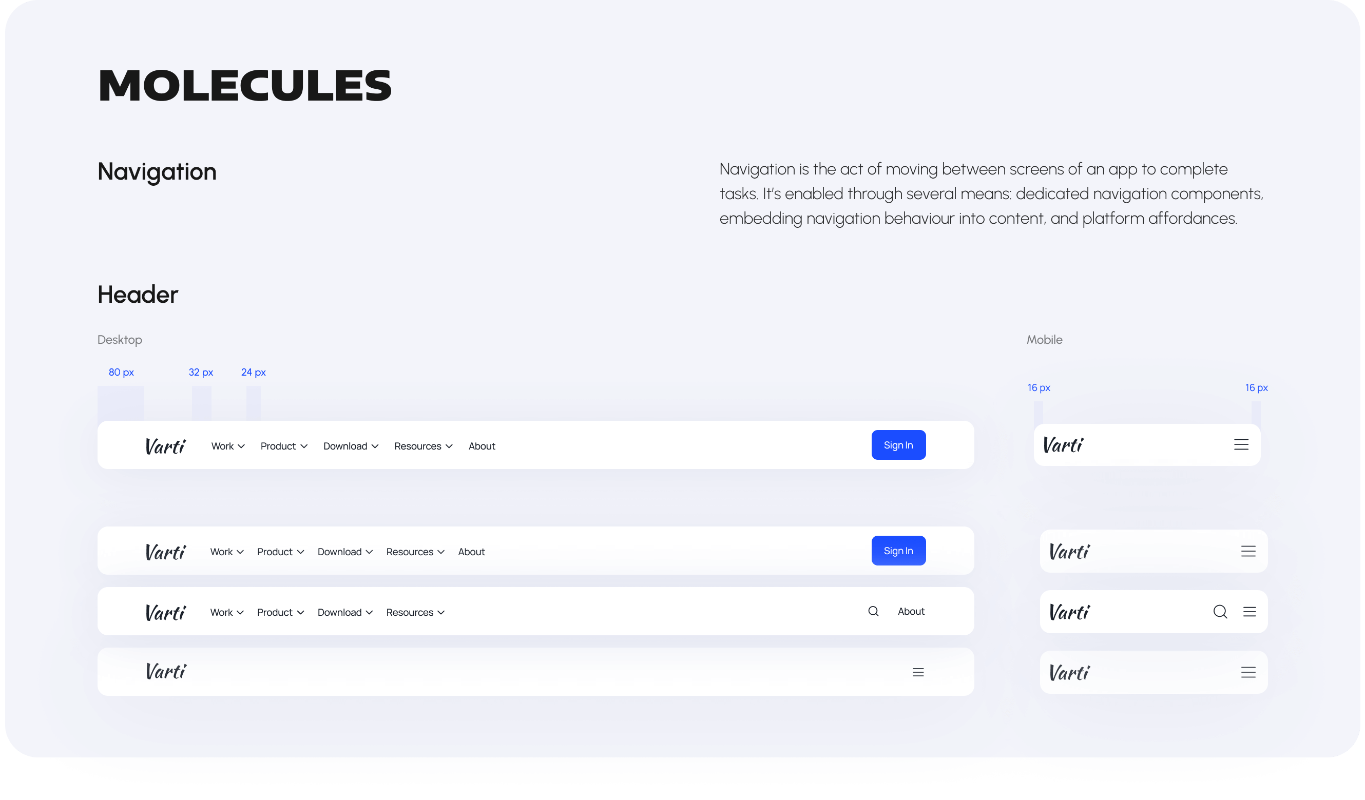
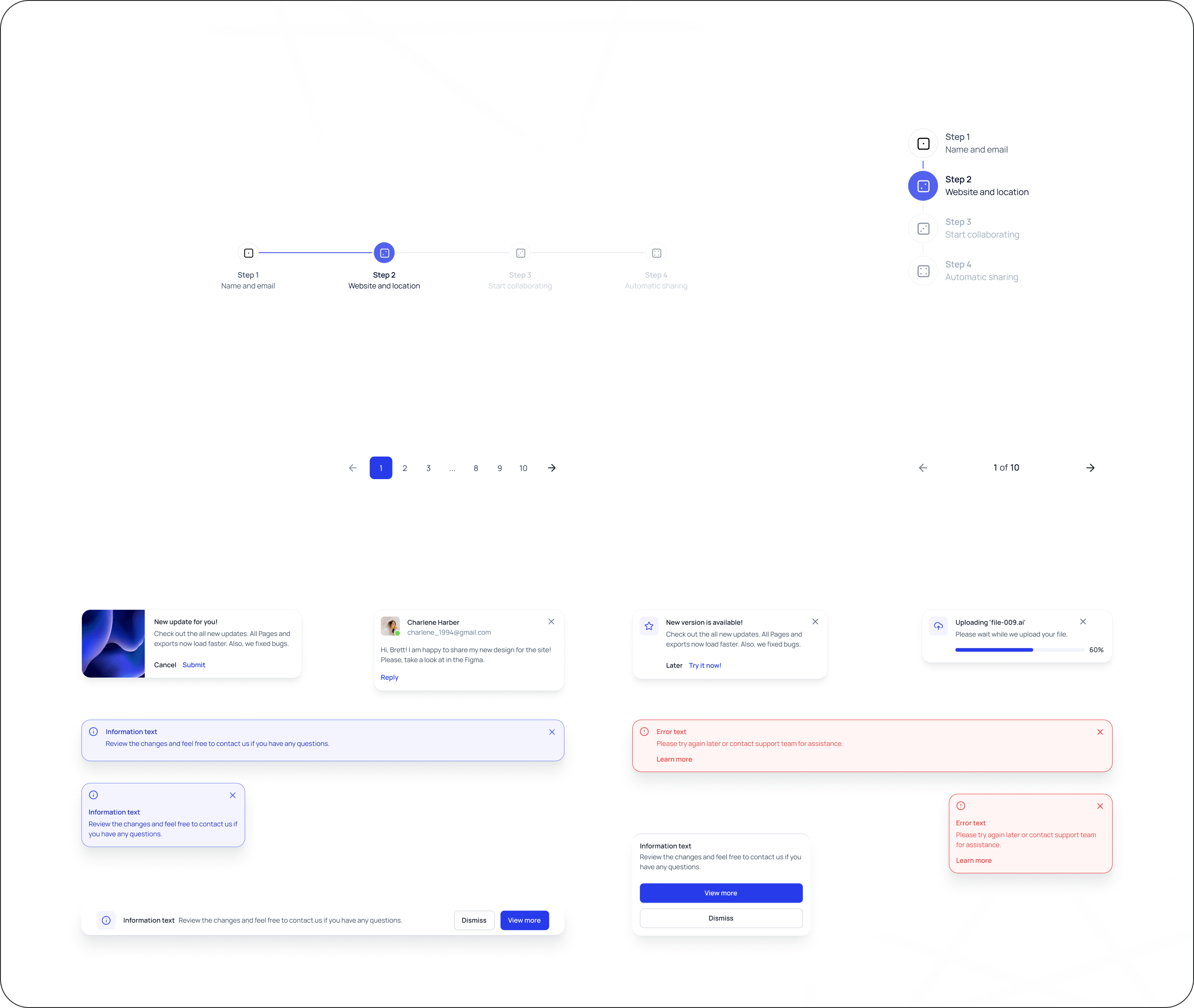
Navigation
Navigation is the act of moving between screens of an app to complete tasks. It’s enabled through several means: dedicated navigation components, embedding navigation behaviour into content, and platform affordances.
Header
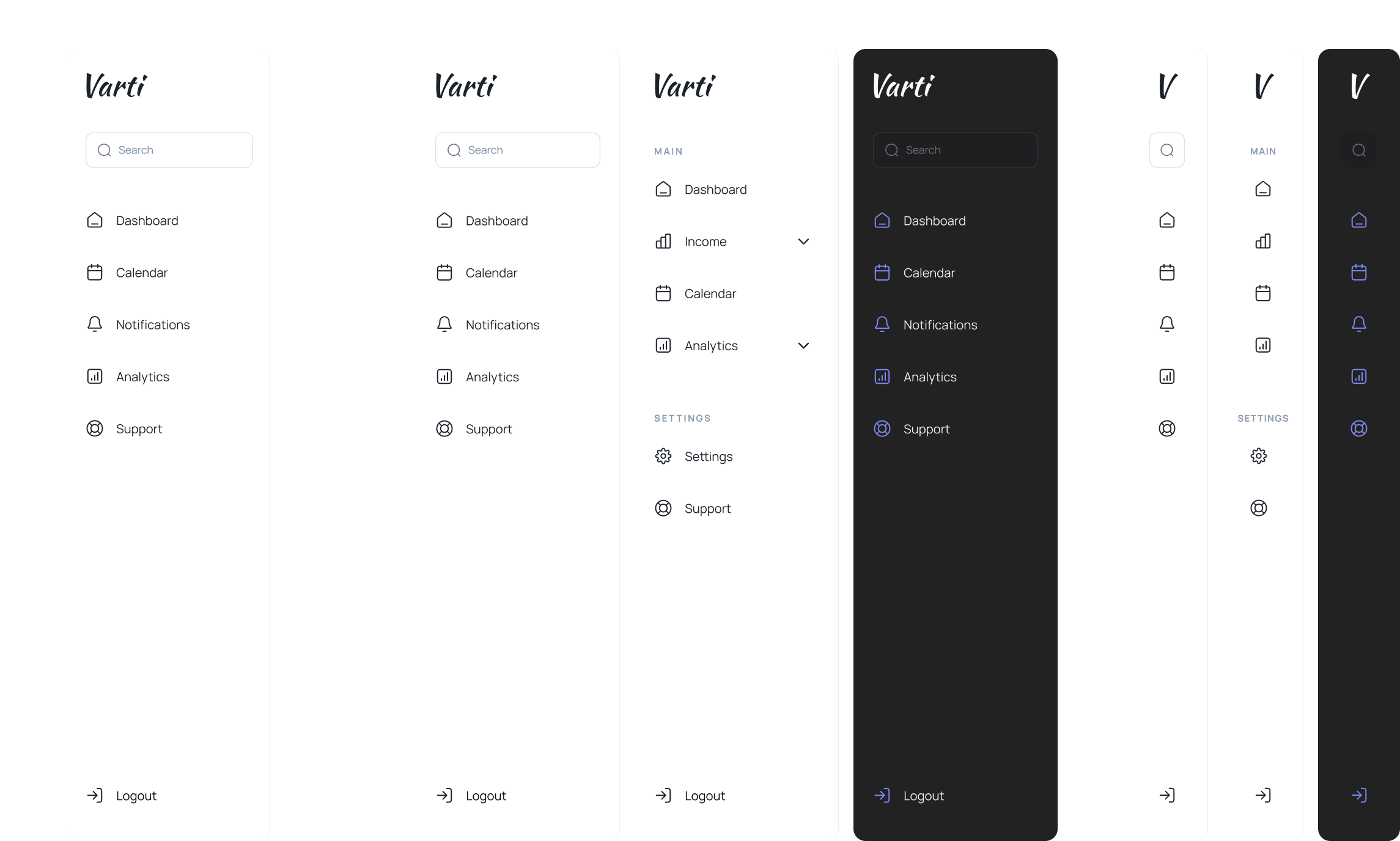
Sidebar
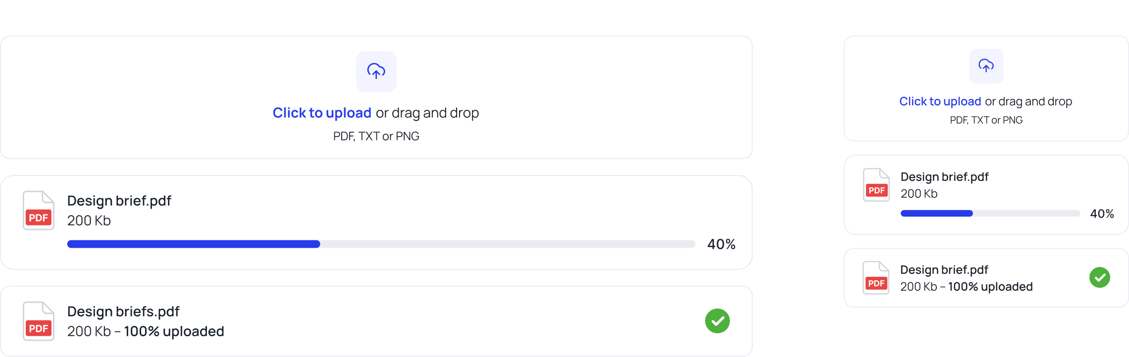
File upload
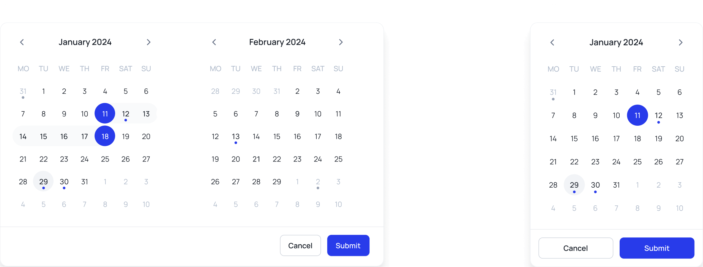
Calendar
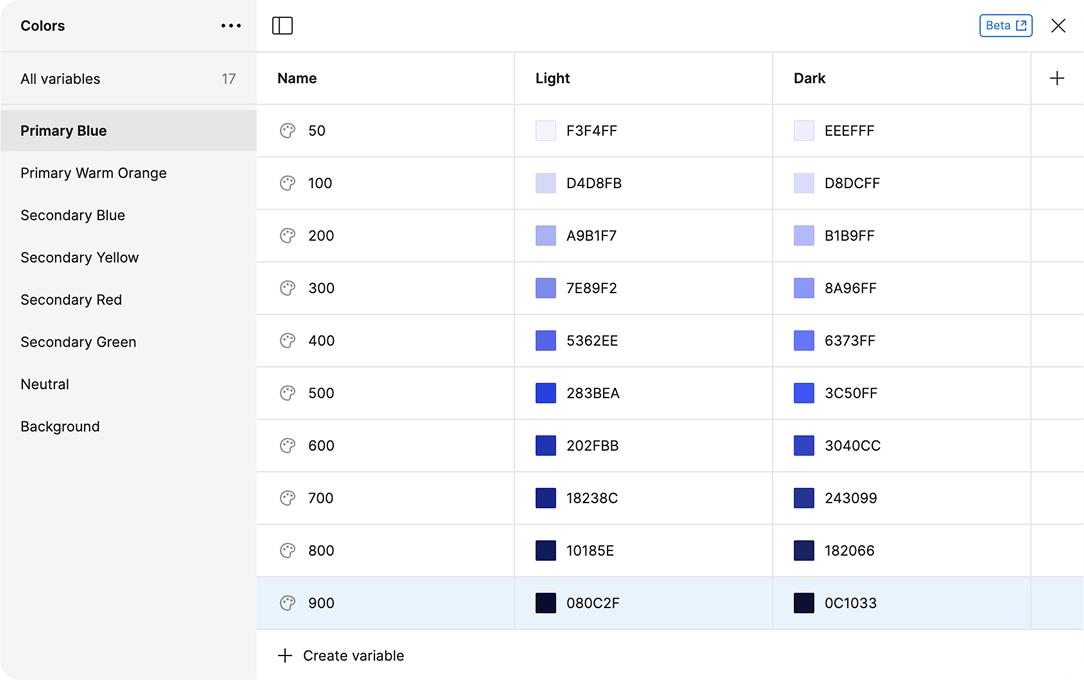
All elements are prepared for variability
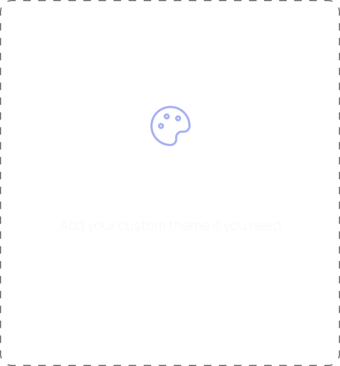
We prepared variables of the colors for the light and dark themes, so you can adjust each of them or create a new one. This method gives you an easy way to design a new theme quickly.
Light theme
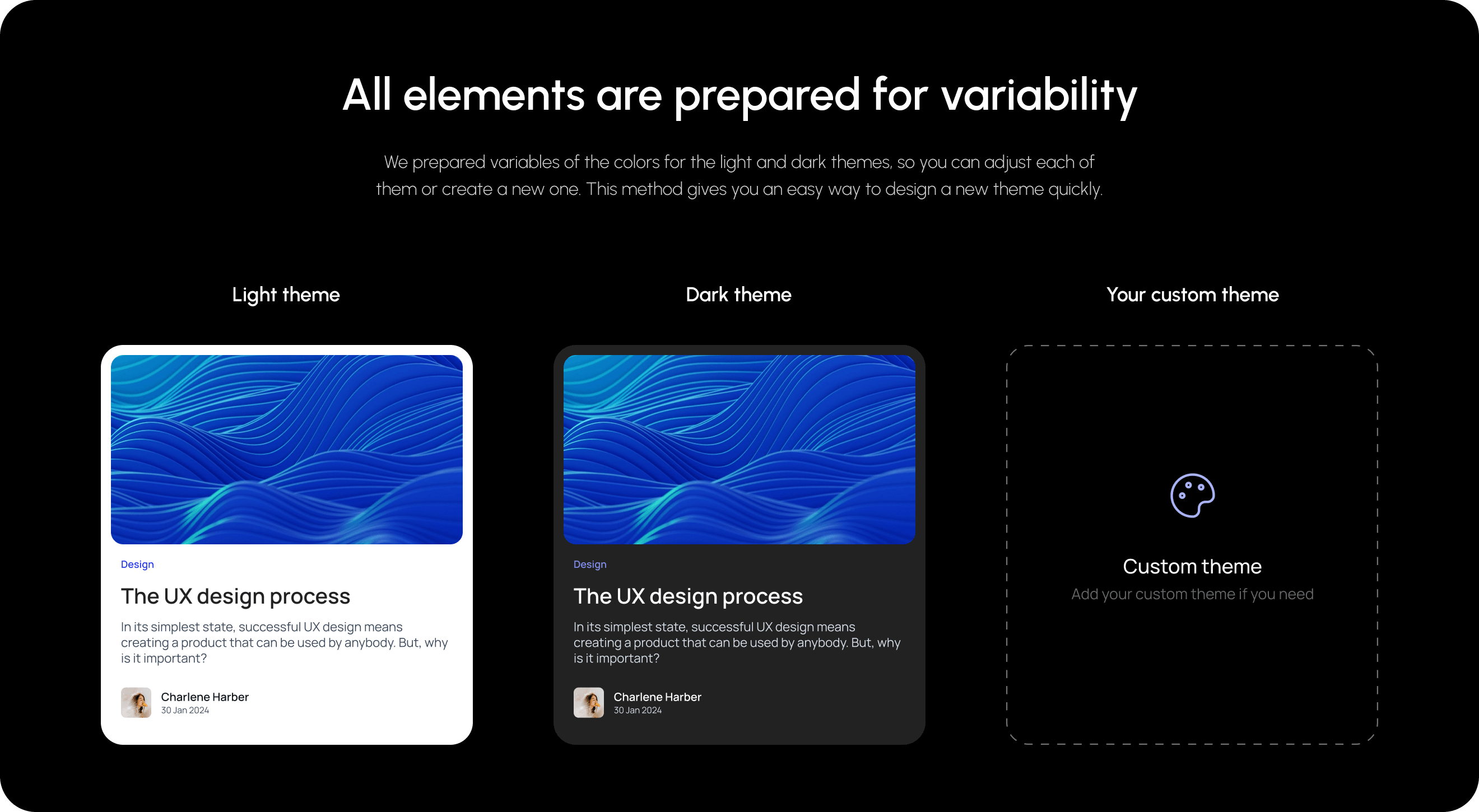
Dark theme
Your custom theme
