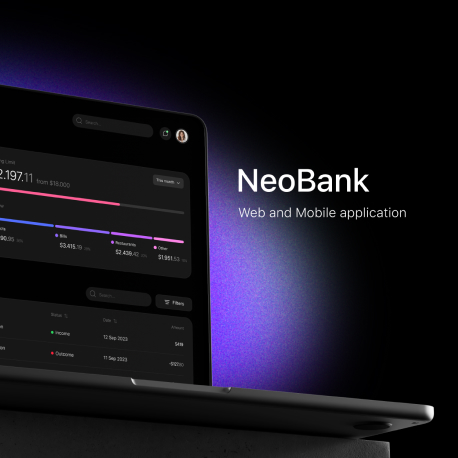
Project overview
Problem
Users often encounter frustration when navigating through a banking app that has a complex and confusing user interface. This problem can lead to difficulties in finding essential features, understanding the app’s functionalities, and may even deter users from using the app.
Solution
Use clear, concise, and user-friendly labels for menus and buttons. Create a guided onboarding process that introduces users to key features and functionalities step by step. Include tooltips, walkthroughs, or tutorials to help users understand how to use the app effectively.
4
Months of
work
12
Designers and
developers
43
Screens of
application
Stages
Research and
User Analysis
Understand the target audience, their needs, preferences, and pain points. Conduct surveys, interviews, and usability testing to gather insights. Competitive Analysis: Analyze the UI/UX of existing banking apps to identify trends, strengths, and weaknesses.
Search references and Wireframing
Create low-fidelity
wireframes to outline the
basic structure and layout of the app. Focus on key functionalities, navigation paths, and the overall flow of the user interface.
Prototyping and
Test
Build interactive prototypes
based on the wireframes. Prototypes allow for user testing, feedback collection, and refinement before moving to high-fidelity design. Conduct usability testing with real users to gather feedback on the prototype. Identify any usability issues.
UI
Design
Prepare the final design
assets and documentation
for development. Include
style guides, component libraries, and any other resources needed for a smooth transition to the development phase.
“Banks have a new image. Now you have ‘a friend,’ your friendly banker. If the banks are so friendly,
Alan King
how come they chain down the pens?”
UX Research
User Experience research is a crucial phase in creating the UI/UX design for a banking app. This research helps us understand the needs, preferences, and pain points of users, ensuring that the final product meets user expectations. Below are short statistics that we obtained during UX Research:
On average, only 20% of users trust banking apps
23%
users don’t understand navigation on
the another banking apps
18%
users have some troubles with
transfering
64%
users have some problems with
registration on the mobile banking
Persona

ABOUT
Paul is 23 years old and he was born in Seoul. He is a 3rd year student at an IT engineering university. He likes technological innovation and creating mobile applications.
GOALS
- Needs an app for online payments and transfers between other people and different cards.
- To be able to make quick transfers for saving time
- To be able to make deposits without visiting the bank office
FRUSTRATIONS
- Not to be able to set a weekly or monthly limits
- Comission of payments/transfers
- Difficult to find ATM
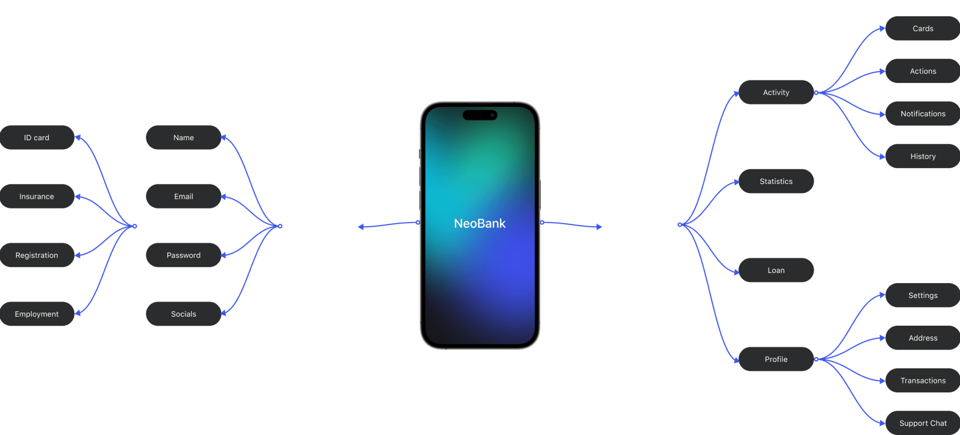
Mind map
The mind map provides a visual overview of the interconnected elements involved in the process of creating a UI/UX design for a banking app.
“The banking industry is much more than just holding, transferring, and lending money; it’s the backbone of any modern society.”
Nout Wellink
Wireframes
Wireframes are skeletal, low-fidelity representations of a mobile app’s user interface. They serve as a visual guide that outlines the basic structure and layout of the app without getting into design details.
…
+32 screens
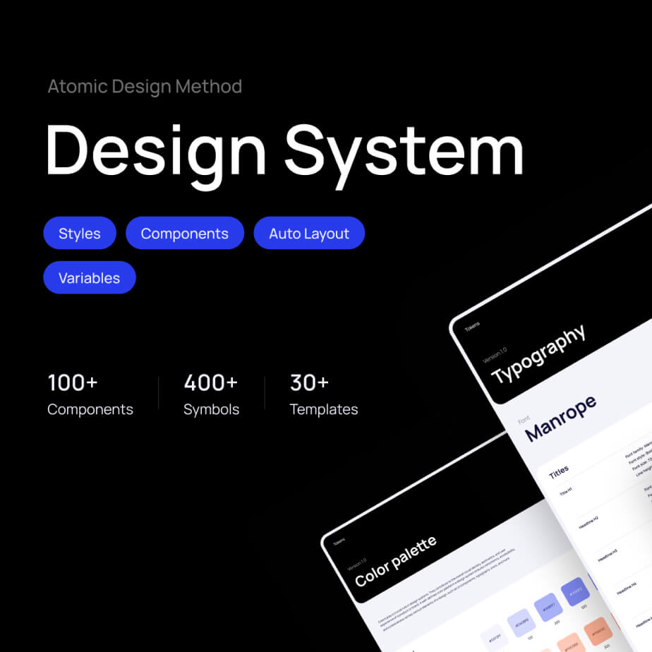
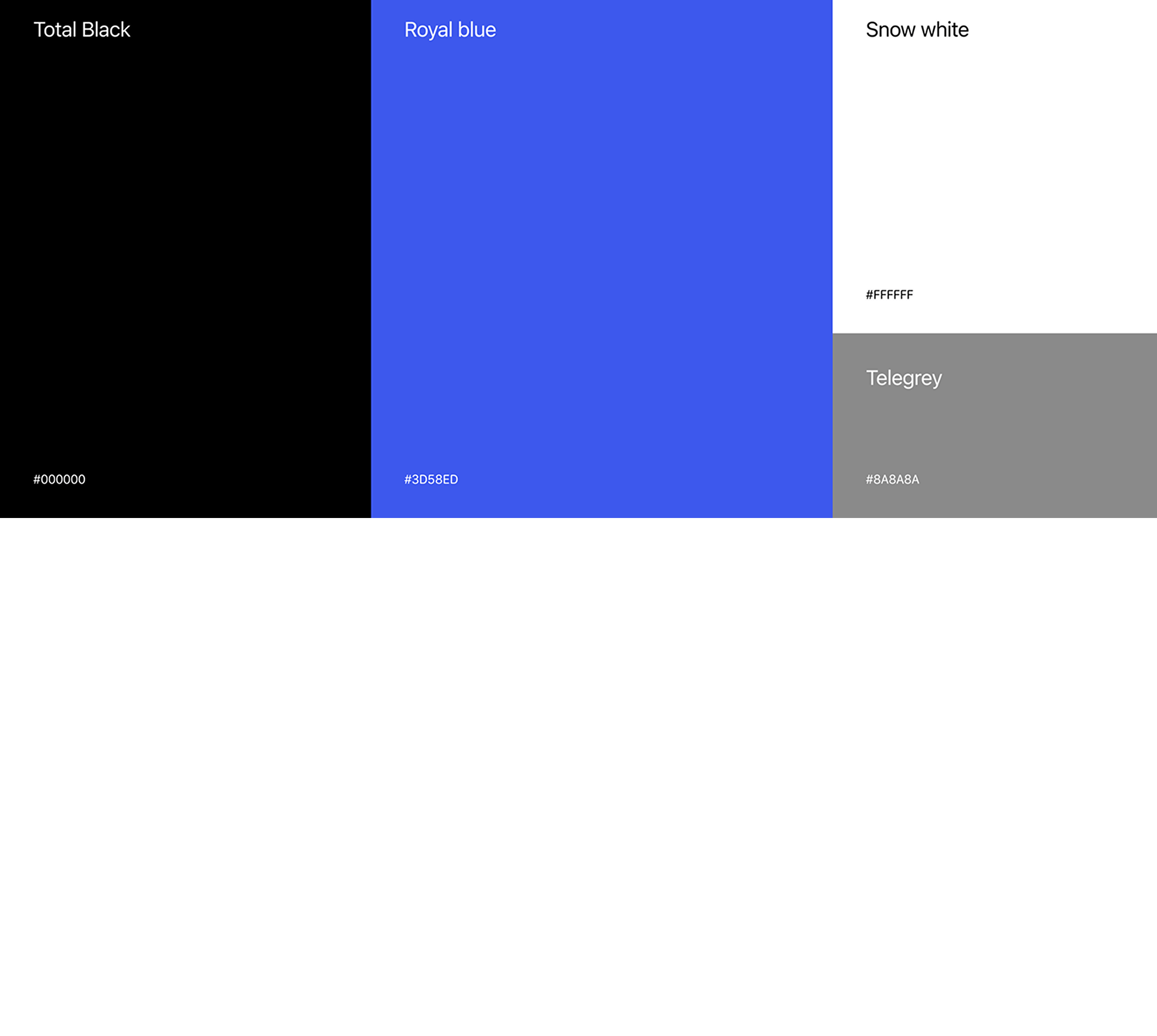
Visual Design
Defined or adhered to existing brand guidelines. Selected a color scheme that aligns with the brand and promotes a sense of trust and security. For a banking app a clean and professional color palette is preferred. Chose legible fonts for different text elements, considering readability on various screen sizes.
Grid System
Design the grid system to be responsive, ensuring that it can adapt to different screen sizes and orientations. This involves creating breakpoints and adjusting the grid layout accordingly.
Colors and Typography
Desktop UI Screens
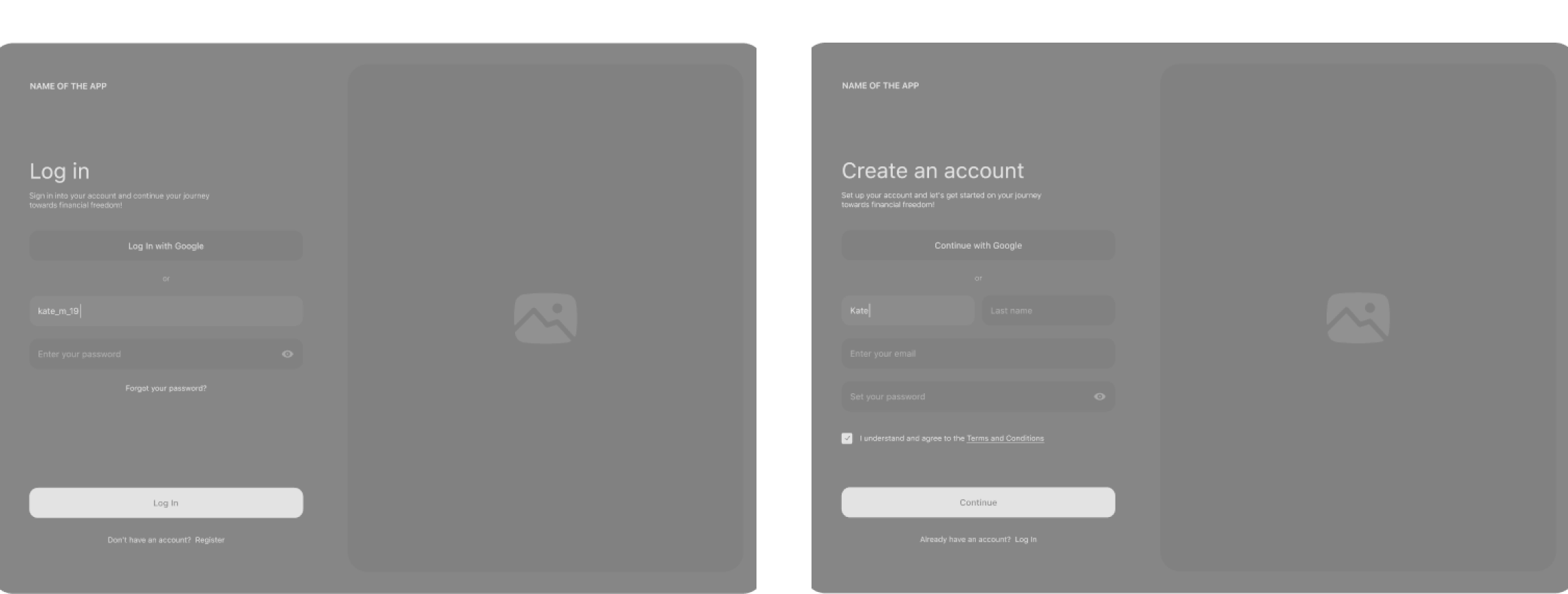
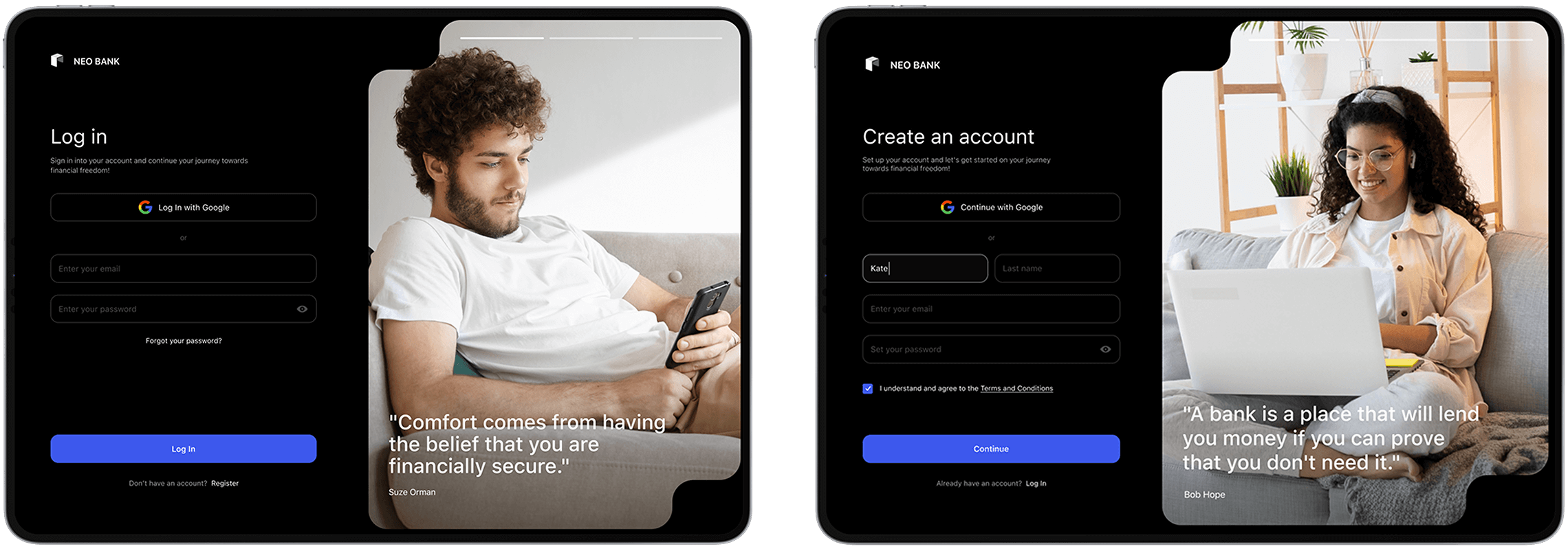
Log In/Registration
The login and registration processes are critical components that directly impact user experience. We created a clean and concise registration form that is presented with fields for essential information such as full name, email address, phone number, and password.
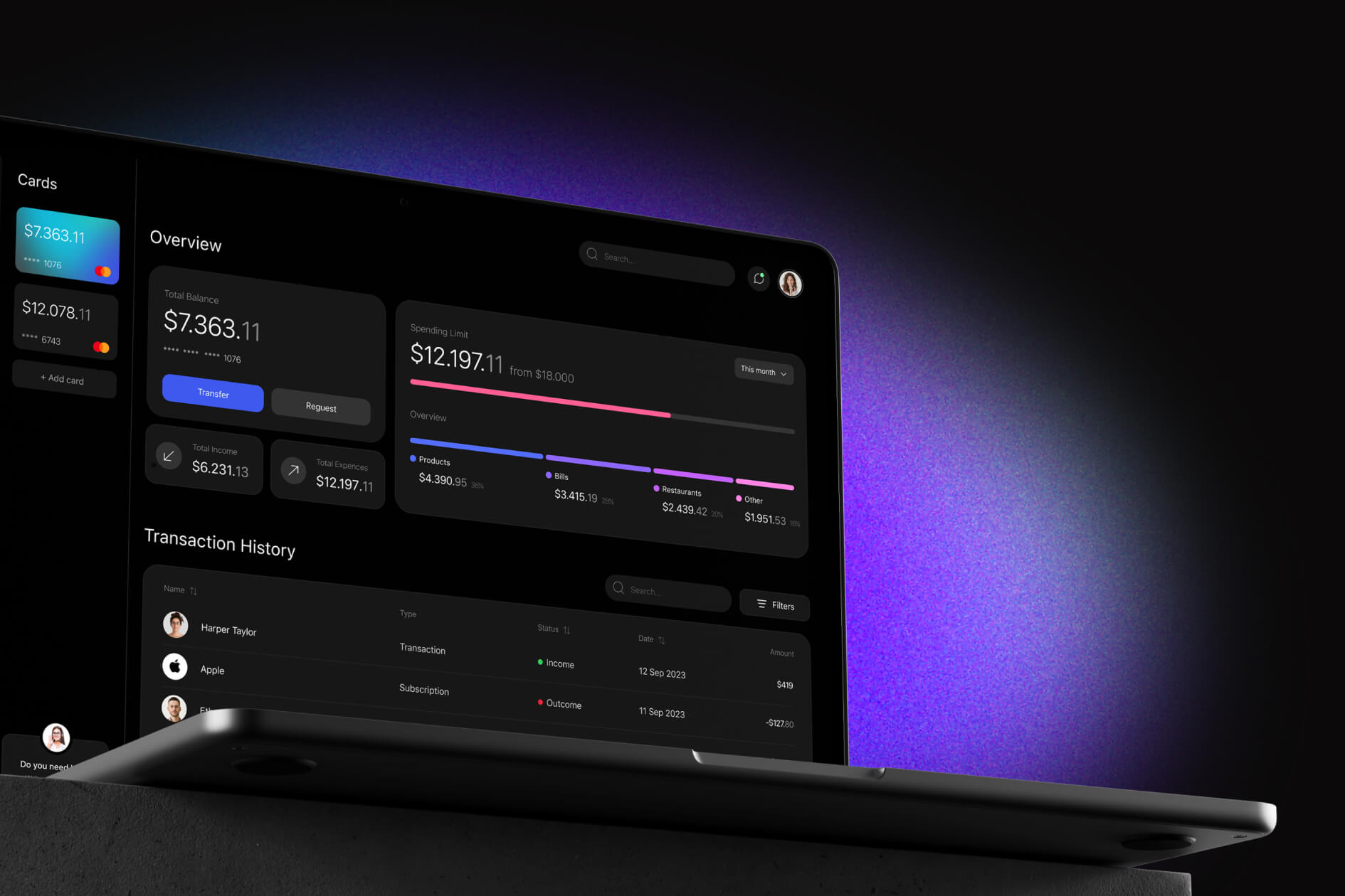
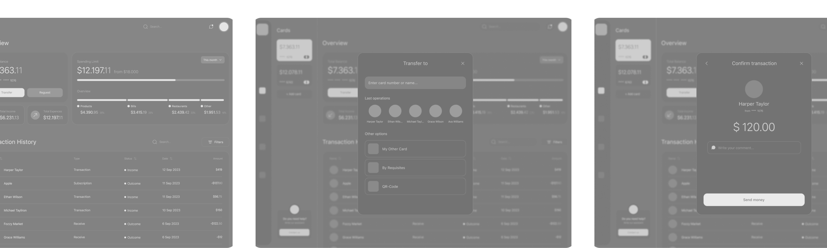
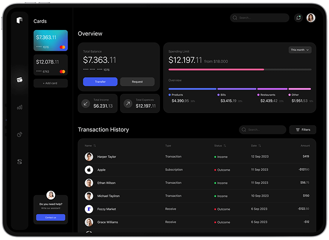
Main page
The main page (Cards) or dashboard as the central hub
where users access key financial information and perform
various actions.
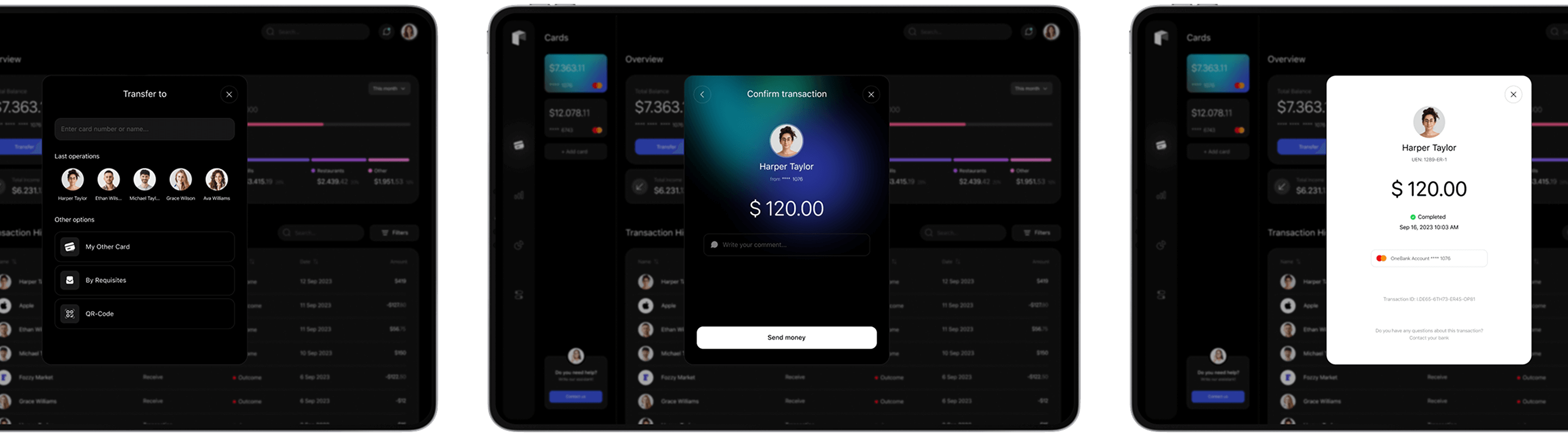
Transfer
We conducted a big research and created a clean and simple transfering process.
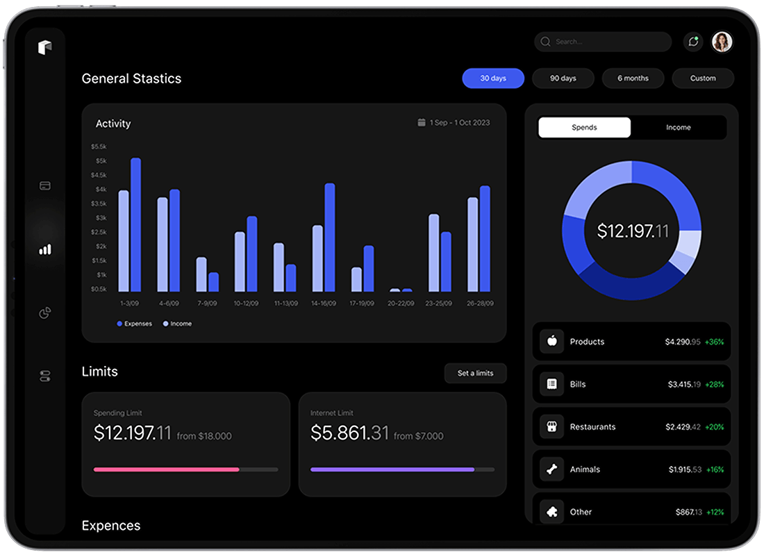
Statistics
Statistics refer to visual representations of financial data and trends that provide users with insights into their spending habits, account balances, and overall financial health.
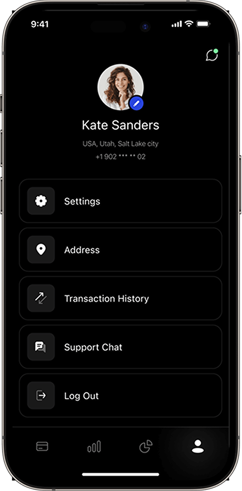
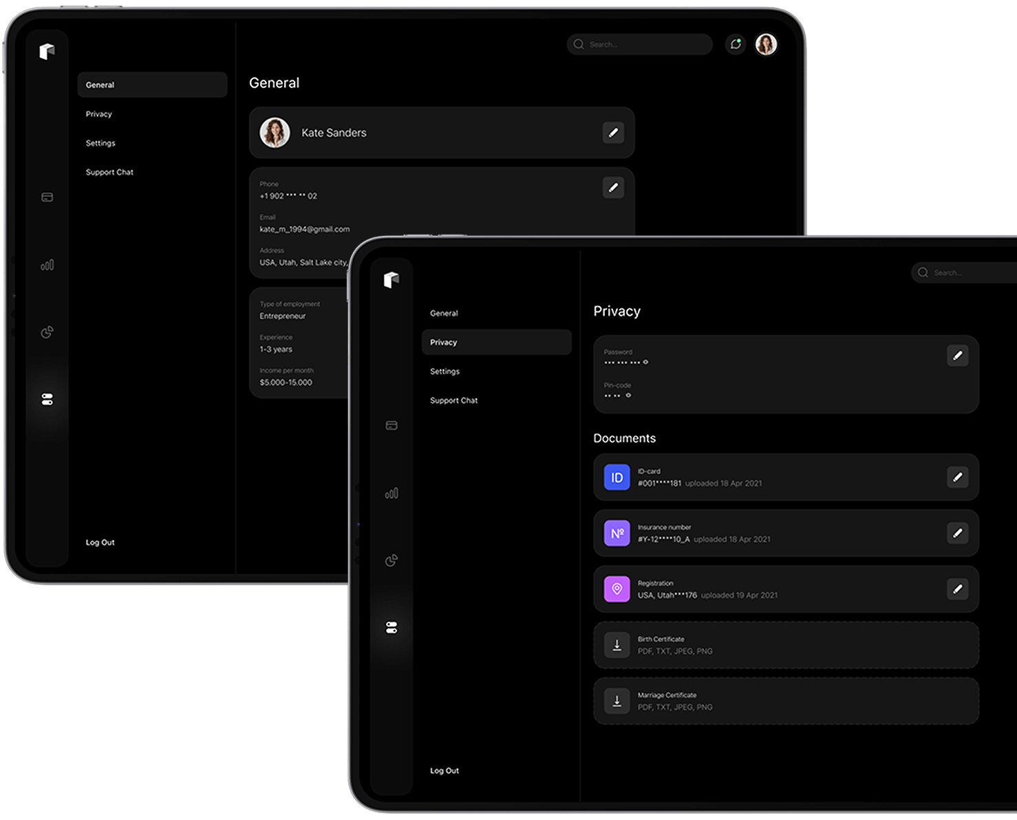
Profile
The users can manage their personal information, account settings, security preferences, and access additional features.
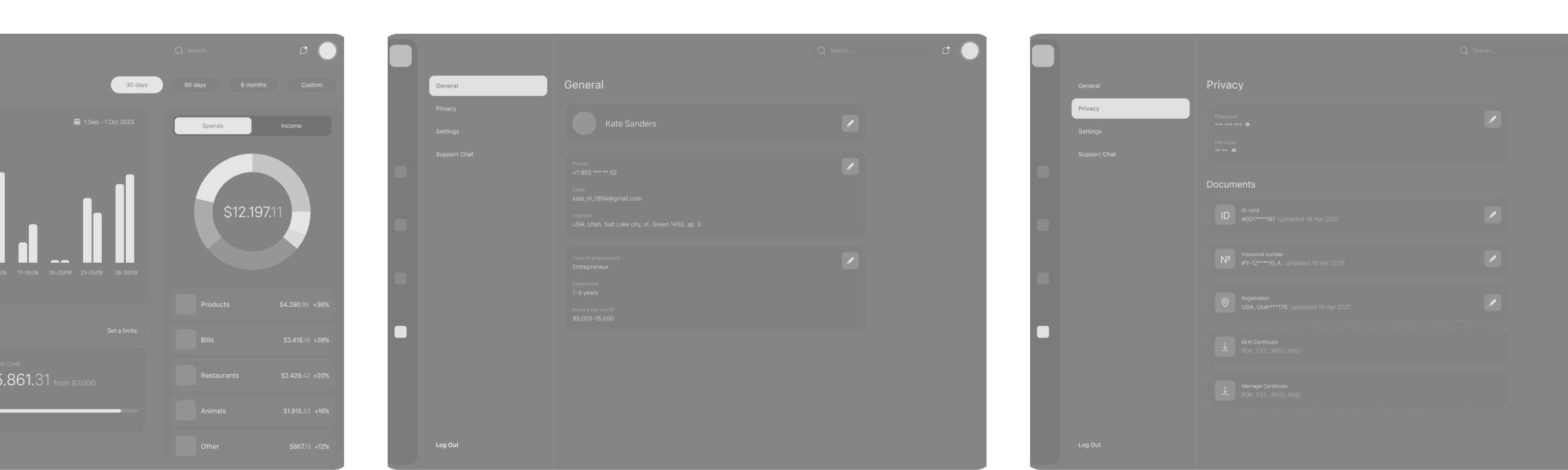
Mobile UI Screens
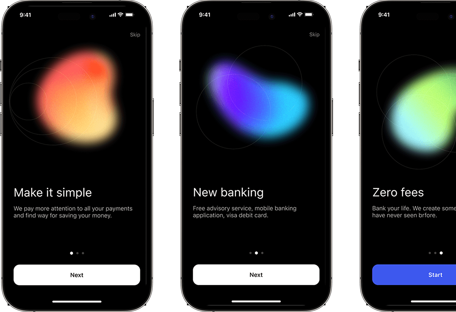
Onboarding
The purpose of these screens is to introduce users to the app’s features, set expectations, and guide them through the initial setup.
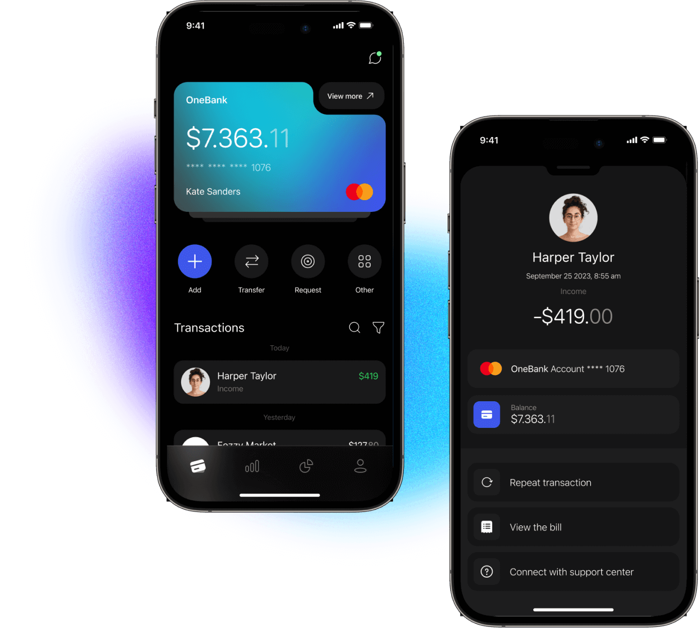
Main screen
The main screen displays the simplified functionality of the main page of the web version. All main functions have been preserved and compactly placed on the screen.
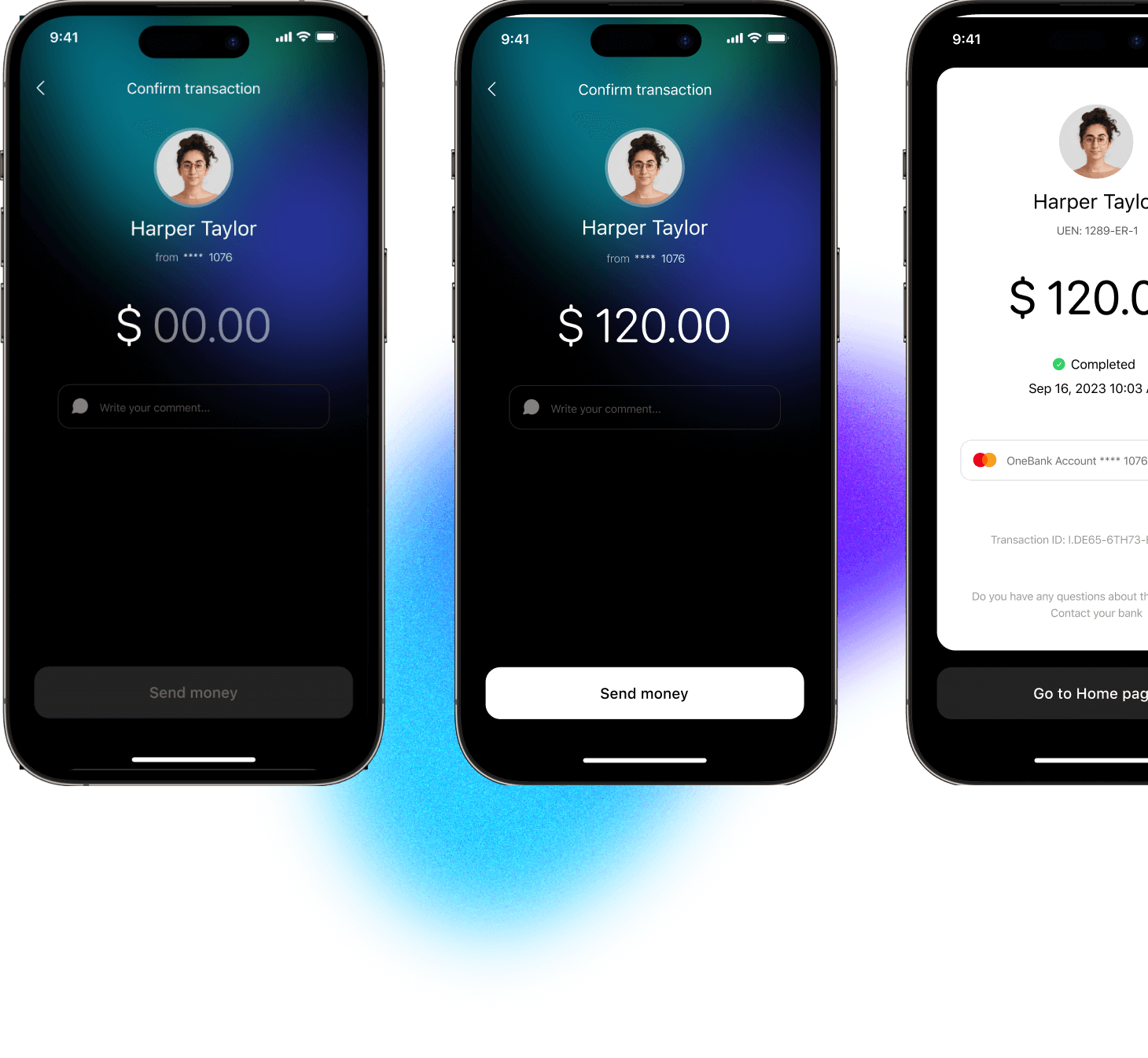
Transfer
We conducted a big research and created a clean and simple transfering process.
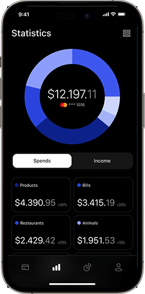
Statistics
The statistics screen helps track expenses and income into your accounts.
Profile
The Profile screen has the same functions as in the web version. Convenient and simple tab navigation will bring pleasure from use.