While building an online product, the principal mission is to achieve users’ attention. Cutting-edge technology and advanced features are great, but at the end of the day, a website is created for humans. That is why putting human needs at the center of the design process has shown significant results.
Since our nature is based on emotions and feelings, website designers should learn how to build a connection between website visitors and the website itself. This can be achieved by learning the psychology of color in web design and improving your brand recognition with the right color choices.
Table of Contents
- Basics of Color Psychology
- Color in Website Design
- Trending Website Color Schemes
- Website Examples
- How to Choose a Color Scheme for a Website
- Final Words
So, let’s uncover the importance of choosing the color scheme in web design and how to thoroughly approach this procedure.
Basics of Color Psychology
Discovering the psychology of color is crucial for delivering the right message with the help of design. For instance, it would be inappropriate to create a fitness application in a monochrome design since it would not call users to action. At the same time, when building a digital library, bright colors might overwhelm the readers and make their receptors overexcited, which will not encourage reading.
How arguable it wouldn’t be, people do judge by the first impression. In 80-90% of cases, the choice is based on the color they see. A lot also depends on how we perceive the visual side of the product. Separately, colors can have one meaning and, in combination, a completely different one. And this is what color theory approves of.
Throughout history, we can trace the paramount meaning of the color, not only for evoking emotions but also for having healing properties. And indeed, since different colors stimulate different parts of our brain, they can improve our memory and overall health state. Color can also psychologically affect a person. For that reason, the influence of color on consumer behavior should not be neglected. When looking at the examples:
- Warm colors like orange, yellow, and red evoke a feeling of passion, happiness, and vitality.
- Cool colors like green, blue, and purple serve for calm, relaxation, and creativity.
- Neutral colors that include white, black, and grey usually create a background in design, but separately can bear other meanings.
- Thus, consideration of color in web design is an essential part of the desig process.
Color in Website Design
When it comes to the effect of color on websites, the subject of aesthetics is usually the first to come up. However, to create a color combination that would convey the values of your company, it’s important to know how to choose those colors and shades so they form a complete picture.
To identify what color scheme will suit your brand best, designers use the color wheel. It is a diagram on which different colors are displayed with the purpose of seeing how they interact with each other.
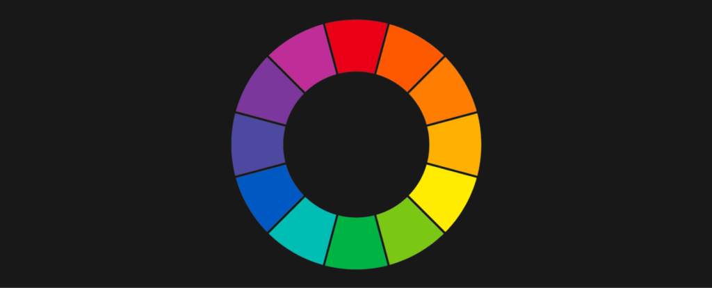
The color wheel tool can be used to identify primary, secondary, and tertiary colors. Therefore, it is possible to see how the colors play with each other and whether there is harmony in that combination.
After deciding on the main color scheme, it is essential to apply color to user interface (UI) elements like text, buttons, and widgets. The main principle of color psychology in UI design is that it should help users focus on the platform. That is to say, when designing website elements, the color has to differentiate the features so that the end user easily copes with them.
Trending Website Color Schemes
The research by the University of Toronto showed that consumers like to see a simple picture in such a way that they can differentiate certain colors and respond to them. A similar tendency is also observed in popular trends in website color branding. Let’s take a closer look at what color schemes are gaining popularity in web design.
Neutral and Soft Tones
With bright colors going back to the past, nowadays, more companies form their websites in appealing, classy tones. Going from brown to beige and white, these neutral and organic colors create a feeling of comfort and minimalism. Along with muted tones, there is minimal text that makes the site look elegant.
Retro Style
Retro pink and green or yellow and orange make a perfect combination while referring to the past. The feeling of being transported to the good old days arouses emotions of excitement and serves such industries as crypto wallets or even barber shops.
Nature Inspired
With the tendency to go eco, many brands have been switching to designs inspired by nature. Carefully chosen shades of brown and green with images of natural phenomena can build trust and sustainability in the eyes of a consumer.
Metallic
Nothing can be more solid than metal. At least for some people, this is the first association they get when looking at liquid metal web designs. Along with the futuristic notes, metallic colors add some kind of strong feeling that will definitely influence decision-making.
Website Examples
From theory to practice, let’s see how to use color in web design and how it shapes users’ point of view of you as a brand.
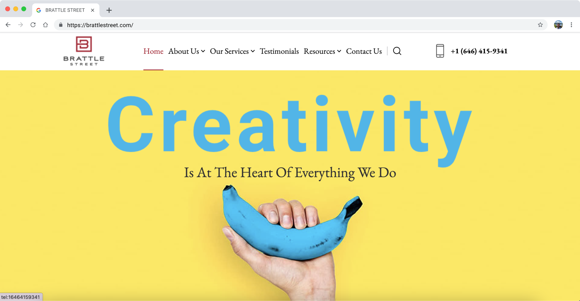
Brattle Street
A non-profit organization, Brattle Street, uses yellow and blue in its color scheme. It creates a feeling of cheerfulness and reliability. And this is what students need when they turn to the service for consultation. The design of other pages is connected with education and is performed in green and blue colors that motivate students to study.
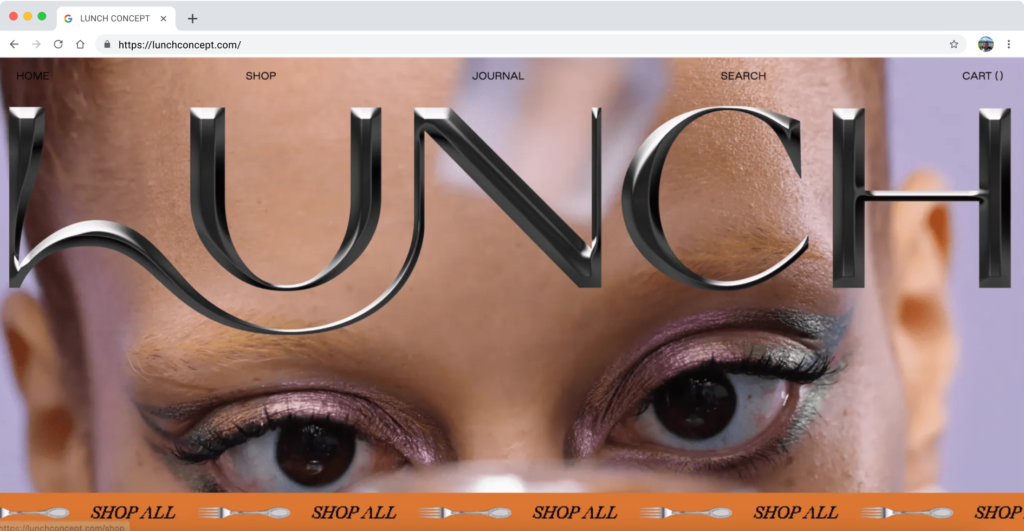
Lunch Concept
Color psychology in the branding of Lunch Concept is focused on metallic typography. While looking at the home page, users see the video with this huge brand logo. And it adds to the security and reliability of the service. There is also a feeling that the letters are voluminous as if you want to touch them and explore the platform.
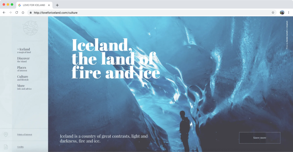
Love for Iceland
The tins and shades of blue are what everyone would associate Iceland with. This symbolism has been implemented into the Love for Iceland project design. By looking at one page of their website, you can already start to feel the cold ocean spray on yourself.
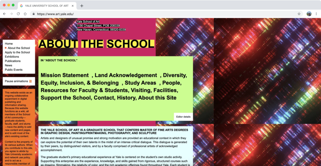
Yale University School of Art
Along with good examples of color psychology in graphic design, we can find examples from which designers can learn. When entering the Yale University School of Art website, students expect to see a leading-edge design. But instead, what we see is an unsuccessful combination of colors from different color schemes. There is not even a point on the site that you can cling to with your eyes. So, instead of attracting applicants, the website scares them away.
How to Choose a Color Scheme for a Website
Now that we’ve covered the topics of color psychology in marketing, here we present some tips on how to make the right choice of color scheme for web design.
- Choose a primary color. According to the 60/30/10 rule, the main color takes up 60% of the area on the website. That means that it should be chosen based on your goal and the psychology of your customers.
- Think of the secondary color. As you add more colors, it is important to try them and see the color scheme. You can choose between complementary, monochromatic, and analogous.
- Add contrast. There should also be an accent color that creates a contrast between the colors.
- Align with simplicity rules. Beauty is in simplicity. It also refers to color psychology in UX desing. Create for humans, not for yourself.
Final Words
Color psychology is the fundamental study that allows designers to get a deeper understanding of how consumers react to what they see. The color influence on decision-making is significant. While you think adding a lot of red colors will attract more people, if not combined correctly, it can, on the contrary, cause them to go away. That is why learning color psychology and its basics is crucial while designing a website.