Mobile app design is the foundation of a successful user experience. Even great functionality loses its impact if the app is clunky or looks sloppy. Design mistakes not only ruin the first impression but also turn off potential users. By understanding the mistakes to avoid, an app can remain visually appealing and functionally effective.
Table of Contents
- How Mistakes in Mobile App Design Can Ruin the Project
- 10 Mistakes in Mobile App Design
- How to Avoid Common Mistakes
- FAQ About Mistakes in Mobile App Design
How Mistakes in Mobile App Design Can Ruin the Project
Neglecting mobile app design can result in serious consequences for any project. When usability issues arise, users abandon the app in favor of alternatives. Poorly structured navigation, cluttered layouts, and unresponsive elements diminish trust and reduce the chances of long-term success.
A well-designed app meets mobile UX and UI standards, making it easy to use. Poor mobile app design leads to confusion and frustration. Fixing issues early saves time and improves user experience.
10 Mistakes in Mobile App Design
Mistakes in mobile app design can have a significant impact on user interest and retention. Frustrating experiences make users leave for apps that are easier to use. Understanding these common pitfalls helps designers create applications that are functional, aesthetically pleasing, and user-friendly.
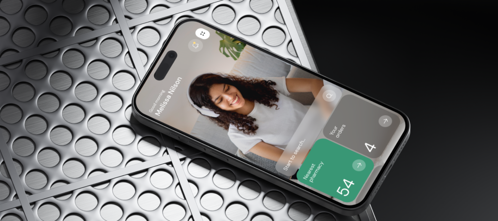
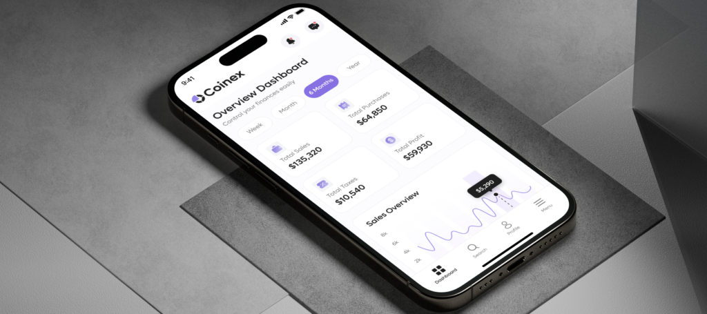
An Overloaded Interface
A large number of decorative elements, buttons, and texts not only looks chaotic, but also creates significant difficulties for users. Instead of improving usability, such design choices require extra effort to find key functions, potentially driving users away.
Ways to prevent this issue:
- Prioritising essential functions provides clarity. For example, in a taxi app, the primary focus should be on ‘order a ride’ and ‘choose a route’, while secondary features should be less prominent.
- Minimalist principles improve usability. A limited colour palette, simple shapes and a clear hierarchy of elements improve the overall user comfort.
- Intuitive layouts eliminate the need for additional instructions. When designed effectively, interfaces lead users naturally to their goals.
Modern mobile app design services emphasize simplicity and efficiency, helping users accomplish goals with minimal effort.
Excessively Long Text
In today’s world, few people like to read a lot. Especially when users open an application with a specific goal in mind – whether to browse products, request services, or check out promotions. When text exceeds available space or lacks structure, the interface appears disorganized and reduces readability.
Possible solutions:
- Setting character limits for text fields prevents overflow. For instance, restricting titles to 100 characters ensures proper display.
- A “read more” button allows longer content to be presented without cluttering the screen.
- Scrollable text blocks keep large amounts of information compact while maintaining a structured layout.
Well-optimized text placement enhances readability and ensures that key information remains accessible.
Inconvenient Navigation
Users expect to find what they want in two or three clicks. If it takes too long, they will quickly lose interest in the app.
Approaches for improving navigation:
- Familiar navigation models, such as top menus or hamburger menus, provide ease of use.
- Consistency in the placement of elements increases predictability and reduces confusion.
- Usability testing with real users helps identify and resolve potential navigation bottlenecks before launch.
A well-structured navigation system not only improves retention but also encourages repeat use.
Lack of Visual Cues During Loading
Periodic data loading occurs in most apps. However, the lack of visual feedback during this process creates uncertainty and gives the impression that the app has frozen.
Ways to address this:
- Progress indicators such as animations, loading bars or rotating icons signal that the app is still responsive.
- Informative messages such as “Loading, please wait” reassure users that the process is ongoing.
Clear visual feedback reduces frustration and increases confidence in the stability of the app.
Inconsistent Design
A harmonious combination of colours, fonts and styles is the foundation of professional design. Lack of consistency creates an unpolished look and increases cognitive load.
Ensuring design consistency:
- A design guide that defines colour palettes, typography, and element proportions serves as a reference for maintaining uniformity.
- A consistent style across all screens builds brand recognition and user confidence.
Users appreciate predictable and visually harmonious experiences.
No Option to Return to the Previous Step
Multi-step processes, such as registration or checkout, often require corrections. The lack of an option to go back and correct information increases frustration and may lead users to abandon the process altogether.
Preventing this issue:
- A visible “back” button at every stage allows easy corrections.
- Editable input fields without requiring a page reload simplify adjustments.
Giving users control over corrections improves usability and satisfaction.
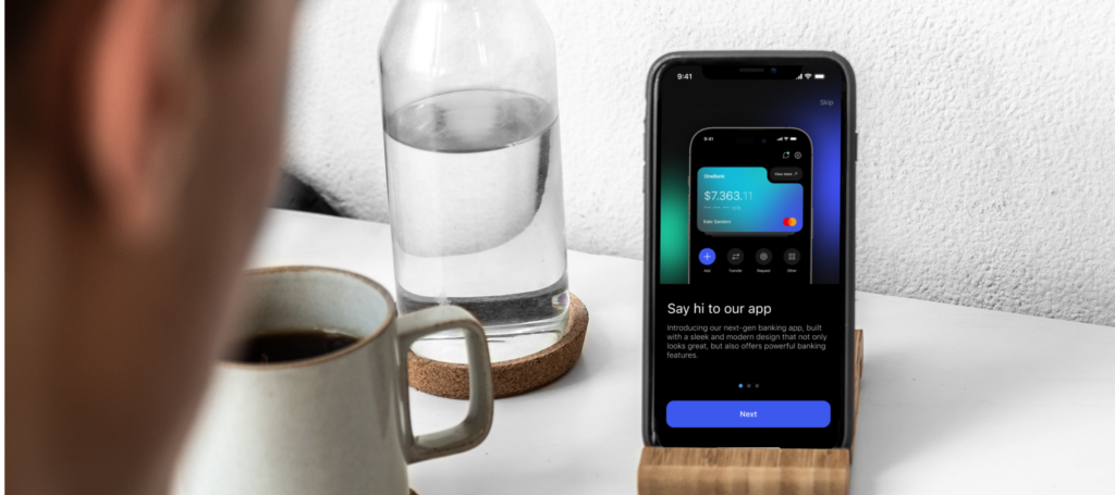
Ineffective Onboarding
The first interaction with an app plays a crucial role in forming a lasting impression. If users struggle to understand how it works, engagement levels drop rapidly.
Effective onboarding strategies:
- Short interactive tips. For example, highlighting the main buttons with short explanations: “Here you can view the message”.
- Key features should be demonstrated in action. For example, financial apps can show quick access to account balances.
- A step-by-step introduction prevents information overload by gradually revealing functionality.
А smooth onboarding process increases user confidence and adoption.
Lack of Button Feedback
If buttons do not provide a visual or tactile response to interaction, users may assume the app is unresponsive.
Ways to improve feedback:
- Visual effects, such as colour changes or subtle animations, confirm interactions.
- Loading indicators (or text like “Waiting”) for delayed actions, such as form submissions, reduce uncertainty.
- Haptic feedback in mobile apps provides additional confirmation through slight vibrations.
Interactive responses create a smoother, more intuitive experience.
Ignoring User Research
Apps developed without considering real user needs often fail to meet expectations. Misaligned features reduce engagement and limit usability.
Steps to incorporate user research:
- Surveys and interviews help identify user preferences. For example, e-commerce apps benefit from insights into preferred filtering options.
- Prototype testing with real users uncovers usability issues early in development.
- Behavioral analytics track interactions to determine which features receive the most engagement.
This helps to adapt the design to realistic expectations.

Excessive Notifications
Notifications are an effective engagement tool, but frequent or irrelevant alerts lead to frustration. Overuse often results in users disabled notifications altogether.
Optimizing notifications:
- Messages should remain relevant and valuable. For example, a shopping app should prioritize alerts about discounts on previously viewed items over general promotions.
- Personalisation settings allow users to control their notification preferences.
Well-managed notifications increase engagement rather than becoming a source of annoyance.
How to Avoid Common Mistakes
By focusing on the principles of mobile UX and UI, common mistakes in mobile app design can be prevented:
- Conduct thorough user research to align design with user expectations.
- Test usability before launch to identify weak points.
- Keep interfaces simple and functional for better usability.
- Follow platform guidelines to create a natural experience for users.
Avoiding these errors results in a more effective and user-friendly application.
A well-thought-out mobile app design is essential for success. Every detail, from navigation to button responsiveness, plays a role in shaping user perception. By avoiding common errors, maintaining design consistency, and focusing on usability, designers create apps that not only attract users but also retain them.
FAQ About Mistakes in Mobile App Design
What is the impact of ignoring platform guidelines in mobile app design?
Ignoring platform-specific requirements results in an inconsistent experience. Users expect apps to function as intended on their devices, and failing to follow guidelines can lead to rejection from app stores.
What are the consequences of not optimizing app design for different screen sizes?
Failure to adapt for various screen resolutions results in distorted layouts, misaligned text, and inaccessible features. Optimizing for different devices improves accessibility and usability.
What role does accessibility play in mobile app design, and what are the common mistakes?
Accessibility secure that all users, including those with disabilities, can interact with an app. Common mistakes include poor contrast, missing alt text for images, and lack of screen reader support, all of which make apps difficult to use for a significant portion of the population.
By following ultimate mobile app design guide principles and avoiding these mistakes, designers improve the overall quality of their applications.