In 2007, designers primarily focused on static website designs. Fast forward to today, with the advent of mobile-first indexing, having a mobile-optimized site is essential. Without it, your site might not even appear in search results.
Table of Contents
- What is Responsive Design?
- What is Adaptive Design?
- Responsive vs. Adaptive Design: What’s the Difference?
- Choose Varti Studio as Your Reliable Ally
Now you face a choice between two design philosophies: responsive design and adaptive design. Both aim to make websites mobile-friendly but differ in terms of complexity, cost, and development methodology. Let’s delve into the differences between adaptive and responsive designs to help you make an informed decision.
What is Responsive Design?
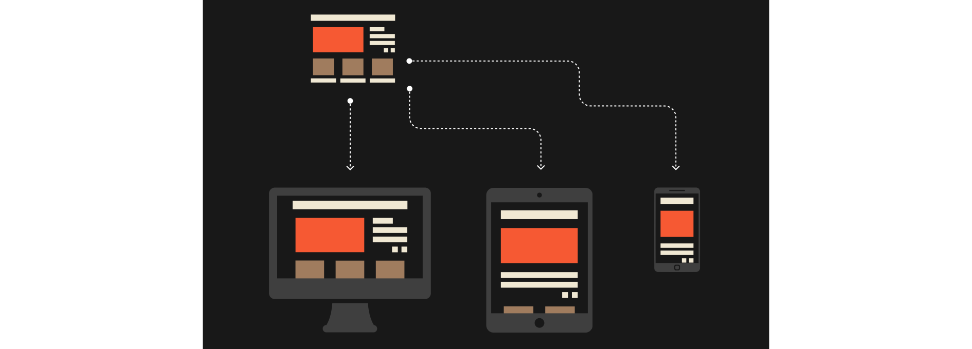
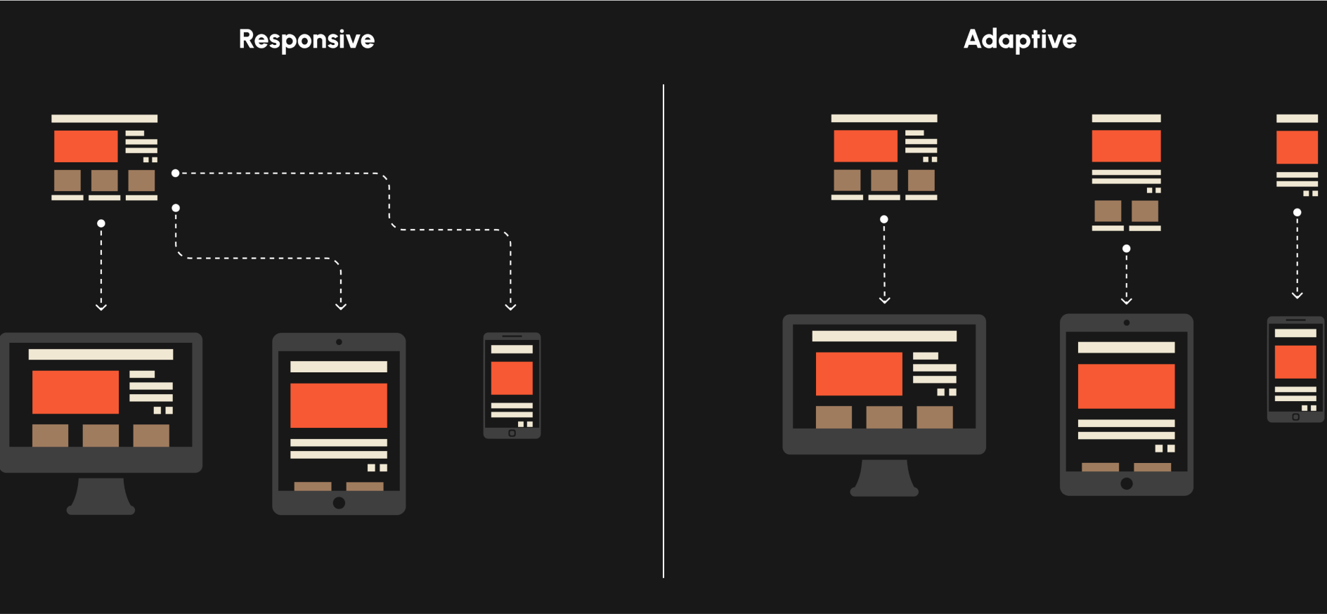
Responsive design is a technique that tailors the website layout and content to fit any device screen size or orientation. This ensures the website works seamlessly on desktops, tablets, and smartphones.
By utilizing fluid grids, adaptable images, CSS media queries, and other design strategies, the website’s content remains consistent. As a result, users enjoy a uniform experience across all devices, enhancing user retention and promoting a cohesive brand image.
Advantages of Responsive Design
Responsive design has long been the go-to method for ensuring a consistent website experience across various devices, preserving your brand’s identity. Here are its primary benefits:
- Consistent user experience with a unified layout;
- Cost savings from managing just one site that adapts to multiple screens;
- Enhanced SEO performance for your primary site;
- Easier content management with one central structure;
- Compatibility with emerging phones and technologies.
Drawbacks of Responsive Design
While responsive design offers numerous advantages, it might not be the ideal choice for larger websites or unique creative endeavors. Here are some potential downsides:
- Challenges in implementing on complex sites with intricate designs and features;
- Longer load times on some devices or under suboptimal network conditions;
- Reduced flexibility in customization because of the standardized design approach.
What is Adaptive Design?
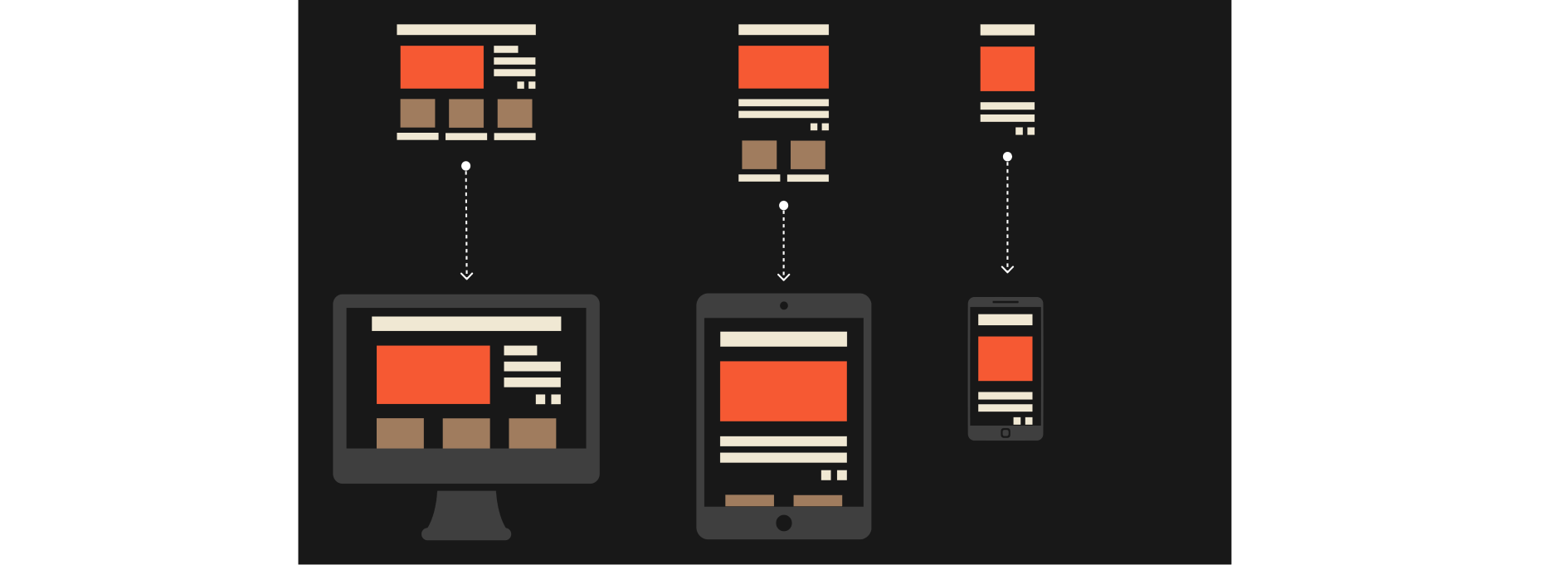
Adaptive design entails crafting distinct versions of a website or app, each fine-tuned for particular screen dimensions and devices. So, there are dedicated adaptive layouts for smartphones, tablets, and desktops.
This method identifies the device’s screen resolution to serve the most suitable design and content. While a responsive site resizes its elements, an adaptive site presents a tailor-made page. It’s an excellent choice for those aiming for an optimal user experience.
Advantages of Adaptive Design
Adaptive design offers a personalized browsing experience by providing device-specific layouts. Here are its primary strengths:
- Enhanced performance and swifter load times since content is fine-tuned for each device;
- Superior user experience as it leverages the unique features and capabilities of each device;
- More design control, given the distinct layouts for different devices;
- Broadened accessibility across various devices.
Drawbacks of Adaptive Design
While adaptive design has its strengths, it might not be ideal for those on a tight budget or those emphasizing SEO. Here are some potential pitfalls:
- Increased development time and effort;
- Elevated costs due to the need to manage several site versions;
- Ongoing challenges in ensuring device-specific experiences remain consistent;
- Potential compatibility hurdles given the vast array of devices;
- SEO difficulties, as search engines could treat each version as an individual site.
Responsive vs. Adaptive Design: What’s the Difference?
While both responsive and adaptive design aim to optimize your website for mobile devices, their distinct approaches can impact both your timeline and budget. Here’s a breakdown of the primary differences between responsive and adaptive web design to guide your decision.
Responsive vs. Adaptive: The Crucial Distinctions
| Definition | An approach that automatically adjusts the website based on the user’s screen size and device | An approach for developing different customized layouts foreach user’s device type |
| Approach | A single layout for all devices, fluid and flexible | Multiple versions optimized for different devices, tailored experiences for specific screen sizes |
| Flexibility | Moderate flexibility due to unified design | High flexibility with device-specific experiences, accommodating varying capabilities of devices |
| Development | Relatively less complex and time-consuming | More complex and time-consuming |
| Maintenance | Easier maintenance with a single codebase | More challenging maintenance |
| Costs | Cost-effective | Higher costs associated with multiple versions |
| Customization | Limited customization | Greater customization, with tailored experiences for specific devices |
| Performance | May have longer loading times on some devices | Improved performance and faster loading times due to optimized content |
| User Experience | Good user experience with a unified structure | Enhanced user experience with device-specific optimizations |
| Accessibility | Accessible and usable across various devices | Improved accessibility for different target devices |
Responsive vs. Adaptive: An In-depth Comparison
Distinguishing between responsive and adaptive design is crucial for making an informed decision for your website needs. Here’s a thorough analysis of their key differences:
Layout:
- Responsive: Uses fluid grids and adaptable elements, ensuring a layout that morphs based on the device’s dimensions.
- Adaptive: Operates with distinct layouts designed specifically for different devices, catering to each screen’s requirements.
User Experience:
- Responsive: Guarantees a uniform user experience across various devices, retaining consistency in branding and navigation.
- Adaptive: Presents a bespoke experience tailored to each device, optimizing based on its unique features.
SEO:
- Responsive: Favoured by search engines due to a single URL and HTML structure, simplifying the indexing and crawling processes.
- Adaptive: Necessitates meticulous handling of multiple URLs and HTML structures, which could impact SEO effectiveness.
Load Time:
- Responsive: Can sometimes face extended load times on certain devices, as all assets are loaded irrespective of device needs.
- Adaptive: Typically offers swifter load times by delivering content customized for the specific device in use.
Flexibility:
- Responsive: Exhibits reasonable adaptability, adjusting to a range of screen sizes while upholding a single layout.
- Adaptive: Displays superior flexibility by customizing structures and content per device, granting more nuanced control.
Complexity:
- Responsive: Generally simpler to execute, often the preferred choice for basic websites with clear-cut layouts.
- Adaptive: Demands more intricate development and upkeep, ideal for extensive projects requiring device-targeted optimizations.
Choose Varti Studio as Your Reliable Ally
Ensuring your product is device-friendly is vital. A seamless UI and UX design can make the difference, preventing potential customer losses due to unappealing layouts. Varti Studio has a track record of consistently providing user-focused design solutions.
For instance, TypeDB, a leading entity in data exploration frameworks, approached us for a sleek and versatile website design adaptable across devices. The task required us to integrate multiple graphical elements and a significant amount of text from their resources. By employing industry-leading methodologies, we crafted a design that met all their aspirations. Witness our work first-hand by visiting typedb.com!
Choosing the Right Design Path with Varti Studio for a Stronger Digital Footprint
Deciding between responsive and adaptive design is rooted in your project’s unique requirements and objectives. While responsive design provides a cohesive experience ideal for straightforward sites, adaptive design serves intricate projects with its enhanced performance and customization options. But, regardless of the choice, expert guidance is imperative. That’s where Varti Studio comes into play. Reach out to us today, and let’s embark on a journey to fortify your brand’s digital footprint!


